Looking to make your narrow galley kitchen feel more spacious and inviting? The right paint colors can work wonders in creating the illusion of more space, instantly brightening the area and opening it up visually. Light, reflective hues are your best friends here—they bounce light around the room, making it appear larger. Opt for soft neutrals like whites, creams, or pale grays, which can make the space seem open and airy, or consider subtle pastels that add a hint of color without overwhelming. The key is choosing shades that reflect natural light and keep the confined space feeling fresh and expansive. By selecting the best paint colors for a galley kitchen, you can transform a tight corridor into a stylish, more open-feeling culinary haven.
A quick answer: Use light, neutral paint colors like white, soft gray, or pastel shades to visually widen your galley kitchen. These hues reflect light and create an airy, spacious feel, making your kitchen seem larger than it really is.
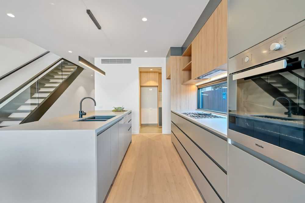
A galley kitchen is often characterized by its narrow, elongated layout, which can make the space feel cramped and confined. But with some strategic choices in paint colors, you can dramatically change the room’s perception. Bright and light hues help bounce natural and artificial light around the space, reducing the sense of restriction. Additionally, sticking to a monochromatic color scheme or choosing shades that are slightly lighter than the existing elements can unify the space and create a seamless, open look. Remember, the goal isn’t just to add color but to choose shades that enhance the sunlight and make every inch feel more expansive.

Best paint colors to widen a galley kitchen visually
Understanding the Importance of Color in Small Kitchens
Choosing the right paint colors can make a small galley kitchen look larger and more inviting. Light shades reflect more light, creating an open and airy feel. Dark colors tend to make spaces feel smaller, so opting for the right hues is essential for visual expansion.
Colors That Expand Your Space
Certain colors work better than others to give the illusion of a bigger kitchen. Light and neutral shades like whites, creams, and soft pastels bounce light around, making the area appear more spacious. These hues also complement various design styles, offering versatility.
White and Off-White Shades
- Pure white creates a clean, minimalist look that makes walls recede.
- Creamy whites add warmth without sacrificing openness.
- Soft ivory enhances natural light, making your kitchen feel larger.
Soft Pastel Colors
Pastel shades like light blue, mint green, or pale yellow brighten small kitchens. They add subtle color without overwhelming the space. These hues can also bring a refreshing touch to the overall decor.
Choosing the Right Finish for Your Paint
The paint finish can impact how much light is reflected and how the color looks. High-gloss finishes reflect more light, making the space look brighter but may show imperfections. Satin or eggshell finishes offer a good balance, providing a soft sheen that enhances light reflection and durability.
Color Combinations to Maximize Space
Using a monochromatic scheme or soft contrast can open up a galley kitchen. Light cabinets paired with a slightly darker countertop create depth without shrinking the space. Conversely, contrasting colors on the walls and cabinets should be used sparingly to avoid making the room feel cluttered.
Vertical and Horizontal Color Strategies
Applying lighter colors to walls and ceilings opens up the vertical space, emphasizing height. Using darker shades on the lower walls or cabinets can ground the space while maintaining an airy atmosphere. Keep ceiling colors consistent with the walls to avoid visual breaks that can close in the room.
Incorporating Color with Accessories and Backsplashes
Sometimes, adding colorful accents can enhance the look without overwhelming the room. Light-colored backsplashes combined with neutral walls create a seamless flow that seems larger. Accessories like curtains, rugs, and utensils in soft colors can complement the wall paint and add personality.
Tips for Using Color Accents Effectively
- Choose accessories in shades similar to your wall color for a cohesive look.
- Avoid bold, dark accents that may make the space feel cramped.
- Use small pops of color to add interest and warmth.
Design Tricks Using Color for Optical Illusions
Colors can sometimes be used to create visual illusions that make a space appear wider. Horizontal stripes or a painted band at eye level can give the impression of a broader room. Similarly, painting the walls and ceiling in the same light shade eliminates heavy visual lines, increasing the sense of openness.
Strategies for Enhancing Space with Paint
- Use light colors on the walls and keep the ceiling white or a very pale hue.
- Opt for glossy or satin finishes to maximize light reflection.
- Paint cabinets in a similar light color to the walls to create seamless continuity.
- Consider two-tone walls with a light top and slightly darker bottom to add depth without closing in the space.
Color Considerations for Small Galley Kitchens
Certain hues can influence the perception of space based on their undertones and brightness. Cooler shades like blues and greens tend to recede, making the room feel larger. Warmer shades, while cozy, can sometimes make a small space seem more confined if not chosen carefully.
Warm vs. Cool Colors
Warm colors such as peach or soft terracotta can add warmth but may shrink the feeling of space if used excessively. Cool colors like icy blue or mint are calming and expand the visual perception. Balancing these hues with natural light helps achieve the best result.
Lighting’s Role in Color Perception
Placing the right lighting can enhance your chosen paint color and its effect on space. Natural light reflects more in light-colored rooms, increasing the sense of openness during the day. Adequate artificial lighting during evenings ensures that light shades stay bright and inviting.
Tips for Lighting and Color Integration
- Use LED or daylight bulbs to emulate natural light indoors.
- Install under-cabinet lighting to illuminate workspaces and brighten the walls.
- Mix different light sources to prevent shadows and dark corners.
Final Thoughts on Choosing the Best Paint Colors
Selecting ideal colors for a galley kitchen involves balancing light, tone, and the feeling of space. Light, neutral shades are often the best choice for making a narrow kitchen seem larger. Remember to consider the natural light, finishes, and accents to create a harmonious, open atmosphere that feels inviting and spacious.
Frequently Asked Questions
What shades can make a galley kitchen appear more open and spacious?
Opt for light and airy colors such as soft whites, pale grays, or gentle beiges. These hues reflect more light and create an illusion of depth, making narrow spaces feel broader. Choosing colors with a matte or satin finish helps reduce glare and further enhances the sense of openness.
Are cool tones effective for enlarging a galley kitchen visually?
Yes, cool tones like light blues, mint greens, and icy grays naturally create a refreshing and expansive atmosphere. These colors tend to recede visually, which can make the walls seem farther away, thus giving the impression of a larger space.
Should I use high-gloss paint to make my galley kitchen look wider?
While high-gloss paints reflect more light, they can emphasize imperfections on walls. For a wider appearance, consider using semi-gloss or satin finishes that provide a reflective quality without overemphasizing flaws. These finishes still brighten the space and contribute to a more open feeling.
How can contrasting colors affect the perception of width in a galley kitchen?
Using a lighter color on the walls and a slightly darker tone on the cabinets can help define the space without cluttering it. Conversely, applying the same light color throughout the walls and cabinets creates a cohesive, elongated look, making the kitchen seem less cramped.
Is it beneficial to incorporate subtle patterns or textures in the paint for a narrower kitchen?
Minimal patterns or textured finishes in light shades can add visual interest without overwhelming the space. Avoid heavy or dark patterns, as they can make the area feel more confined. Keeping the surfaces subtle helps maintain an open and airy environment.
Final Thoughts
Best paint colors to widen a galley kitchen visually include light shades such as soft whites, pale grays, and pastel tones. These colors reflect more light and create an airy feel, making the space appear larger. Using lighter hues on walls and cabinets enhances the sense of openness.
Opt for a monochromatic color scheme to maintain a seamless flow and avoid visual clutter. Incorporate subtle contrasts to add depth without shrinking the space. Accent walls or accessories in bold colors can also add interest without overwhelming the room.
In conclusion, choosing the right paint colors can significantly enhance the perception of space in a galley kitchen. The best paint colors to widen a galley kitchen visually focus on light, neutral shades that promote brightness and openness.