10 Chic Shared Room Decor Ideas with Neutral Colors
When it comes to designing a shared living space, striking a balance between individual tastes and a cohesive aesthetic can feel like a monumental task. However, the power of neutral colors offers a sophisticated and surprisingly versatile solution. Embracing a palette of soft beiges, warm grays, crisp whites, and subtle creams can transform a potentially chaotic room into a serene sanctuary, effortlessly appealing to multiple personalities. These foundational hues provide a calming backdrop, allowing for pops of personality through textures, materials, and carefully curated accents. Let’s explore 10 chic shared room decor ideas with neutral colors that prove this understated approach is anything but boring.
The Foundation of Serenity: Layering Neutrals
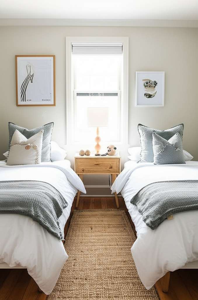
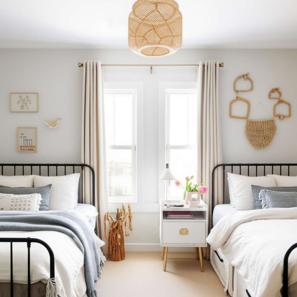
The beauty of a neutral color scheme lies in its ability to be layered. Don’t be afraid to mix and match different shades and tones within the neutral family. Think about a dove gray sofa paired with cream-colored throw pillows, a light beige rug anchoring the space, and crisp white curtains framing the windows. This layering creates depth and visual interest without overwhelming the senses. The key is to vary textures: introduce a chunky knit blanket alongside a smooth linen cushion, or opt for a subtly patterned wallpaper in a soft taupe. This approach ensures the room feels inviting and comfortable, not sterile.
Maximizing Light and Space with Whites and Creams
Whites and creams are the ultimate neutral powerhouses for making any room feel larger and brighter. Opting for off-white or cream walls can soften the space compared to stark white, offering a warmer and more inviting atmosphere. Use these colors generously on walls, ceilings, and even large furniture pieces. To prevent the space from feeling too one-dimensional, introduce varying textures. Think about a boucle armchair, a woven rattan basket, or a marble-topped coffee table. These elements add subtle visual intrigue and prevent the brightness from becoming overwhelming. For more inspiration on using light colors effectively, check out our guide on white kitchen decor ideas that showcase how whites can elevate any space.
The Warmth of Beige and Tan: Creating an Earthy Vibe
Beige and tan hues bring an inherent warmth and earthiness to a shared room. These colors evoke a sense of groundedness and tranquility, making them ideal for spaces where relaxation is paramount. Consider a beige sectional sofa as the centerpiece, complemented by tan accent chairs and throws in varying shades of caramel and sand. Wooden furniture pieces in light oak or walnut will beautifully complement this palette, further enhancing the natural, organic feel. Incorporate natural materials like jute rugs, linen upholstery, and perhaps even some strategically placed potted plants to amplify the earthy ambiance.
The Sophistication of Gray: A Modern and Versatile Choice
Gray offers a sophisticated and modern edge to any shared living space. From light, airy silver-grays to deeper, more dramatic charcoal tones, this color provides a fantastic canvas for diverse styles. A charcoal gray sofa can be a striking focal point, balanced by lighter gray walls and accessories in shades of dove or slate. For a softer approach, opt for a room bathed in lighter grays, accented with metallic touches like brushed nickel or brushed gold for a touch of understated glamour. Gray is also incredibly adaptable, pairing well with almost any accent color if the mood strikes for a temporary change. Discover more about using warm neutrals like gray in our article on warm kitchen color ideas for a cohesive look across your home.
Textural Play: The Secret Weapon of Neutral Schemes
As touched upon, texture is paramount when working with neutral colors. Without varied textures, a neutral palette can indeed feel flat. Introduce a variety of materials to add depth and sensory appeal. Think about a plush velvet ottoman against a smooth leather armchair, a woven wall hanging, or a ribbed ceramic vase. Even subtle variations in fabric weaves, like the difference between a crisp cotton and a soft chenille, can make a significant impact. This textural interplay is what elevates a neutral room from basic to beautifully curated.
Accent Walls with Subtle Neutrals
If a full commitment to a bolder neutral like charcoal feels too intense, consider an accent wall. This could be a wall painted in a deep slate gray, a subtle taupe, or even a textured wallpaper in a sophisticated neutral pattern. This creates a point of interest without dominating the entire room. Pair this accent wall with lighter neutral tones throughout the rest of the space to maintain a sense of balance and harmony.
Bringing in Nature: Wood and Greenery
Natural elements are a perfect complement to neutral color schemes. Wooden furniture, whether in its natural state or painted in a muted tone, adds warmth and organic beauty. Think about a light oak coffee table, a walnut bookshelf, or even simple wooden picture frames. Furthermore, incorporating houseplants brings life and a touch of vibrant green that pops beautifully against a neutral backdrop. The varying shades of green from different plants can act as natural accents, adding visual interest and improving air quality. For more ways to integrate greenery into your decor, explore our kitchen plant decor ideas for inspiration.
Metallic Accents: A Touch of Glamour
While the core of your shared room decor might be neutral, don’t shy away from metallic accents. Brushed brass, polished chrome, or matte black can add a touch of sophistication and subtle glamour. Consider a metallic floor lamp, decorative trays, or picture frames. These elements catch the light and add a polished finish, elevating the overall aesthetic of the room without disrupting the calming neutral foundation.
The Power of Thoughtful Arrangement
Even with the most beautiful neutral colors and textures, the way a room is arranged plays a crucial role. Ensure furniture is placed to facilitate conversation and easy movement. Create distinct zones within the shared space, perhaps a reading nook with a comfortable chair and a side table, or a central area for lounging. Thoughtful arrangement ensures that the neutral palette feels intentional and functional, enhancing the overall comfort and usability of the room.
Personalization Within the Palette
The beauty of a neutral shared room is that it provides a perfect canvas for personalization. Each individual can bring in their personality through smaller, easily changeable items. This could be a collection of books on a shelf, framed artwork that speaks to their tastes, or decorative objects that hold sentimental value. These personal touches, placed against the calming neutral backdrop, will stand out beautifully and ensure the room feels like a true reflection of everyone who inhabits it. Embracing neutral colors for your shared space is an investment in a timeless, adaptable, and effortlessly chic environment.