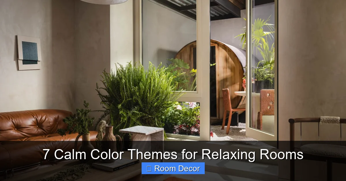
Transform your living spaces into serene retreats with our comprehensive guide to 7 calm color themes for relaxing rooms. Discover how soothing palettes, from gentle earth tones to misty blues, can create a peaceful atmosphere perfect for unwinding. Learn practical tips for selecting base colors, balancing accents, and incorporating textures and lighting to design a truly tranquil haven that promotes relaxation and well-being.
7 Calm Color Themes for Relaxing Rooms
Welcome to the world of serene interiors! Your home should be your sanctuary, a place where you can unwind, recharge, and feel completely at peace. And one of the most powerful tools you have to create this feeling? Color. The right palette can transform a bustling space into a calm oasis, soothing your mind and body.
In this comprehensive guide, we’ll dive deep into 7 distinct calm color themes designed specifically for relaxing rooms. You’ll learn not just what colors to use, but how to layer them, what textures to pair them with, and how lighting can enhance their tranquility. Whether you’re decorating a bedroom, living room, or a cozy reading nook, these calm color themes will help you craft a space that truly feels like a breath of fresh air.
We’ll walk you through each theme, offering practical advice and inspiring examples to help you create your ultimate relaxing room. Let’s begin the journey to a more peaceful home!
Key Takeaways
- Color Psychology Matters: Understand how different calm color themes evoke specific feelings of tranquility and relaxation, guiding your choices for a truly serene space.
- Choose a Base Wisely: Always start by selecting a dominant, muted base color that sets the foundational mood and ensures the room feels inherently calming.
- Layer with Accents Thoughtfully: Introduce complementary accent colors through textiles, decor, and art to add depth and personality without overwhelming the room’s serene ambiance.
- Embrace Texture for Comfort: Utilize varying textures like soft throws, natural wood, woven fabrics, and smooth ceramics to enhance the room’s comfort, visual interest, and tactile appeal.
- Consider Natural Light’s Impact: Assess how natural light interacts with your chosen calm color themes, as it significantly impacts how colors appear and shift throughout the day.
- Test Before Committing: Always sample paint colors directly in your room to see how they look under various lighting conditions before making a final decision on your palette.
- Personalize for True Calm: While using these calm color themes as inspiration, personalize your selections to genuinely reflect what makes *you* feel most relaxed and at ease in your own sanctuary.
1. Seaside Escape: Ocean Breezes and Sandy Shores
Imagine the gentle lapping of waves, the soft feel of sand between your toes, and the expansive horizon of the ocean. The Seaside Escape theme brings this tranquil experience indoors with a palette inspired by coastal serenity. It’s one of the most classic calm color themes, relying on blues, greens, sandy beiges, and crisp whites to evoke a sense of open space and freshness.
Choosing Your Base Color
For your primary wall color, think soft. A muted aqua, a pale sky blue, or a sandy off-white works beautifully. These colors will reflect light and create an airy, expansive feel. Avoid anything too vibrant; the key here is subdued elegance. A light, desaturated blue or a very pale green with a hint of grey will lay a perfect foundation for these calm color themes.
Adding Complementary Accents
Layer in accents that mimic natural coastal elements. Crisp whites in trim and ceilings will make the room feel clean and bright, much like whitecaps on the ocean. Introduce driftwood tones through wooden furniture or decorative items. Sandy creams and deeper beiges can appear in rugs, upholstery, or textured cushions, grounding the blues and greens. Touches of coral or very pale seafoam green can add subtle interest.
Incorporating Textures and Materials
Texture is crucial for adding depth to calm color themes. Think natural materials: linen curtains that billow gently, soft cotton throws, and jute or sisal rugs underfoot. Rattan furniture, woven baskets, and natural wood pieces (especially those with a distressed or white-washed finish) enhance the beachy vibe. Smooth ceramic vases or polished shells can provide tactile contrast.
Lighting for Ambience
Soft, diffused lighting is essential. Allow as much natural light as possible to flood the room. For artificial light, use warm white bulbs (2700K-3000K) and fixtures that spread light evenly, like lamps with fabric shades or frosted glass globes. Consider string lights or candles for an extra layer of soft, evening glow, perfect for relaxing.
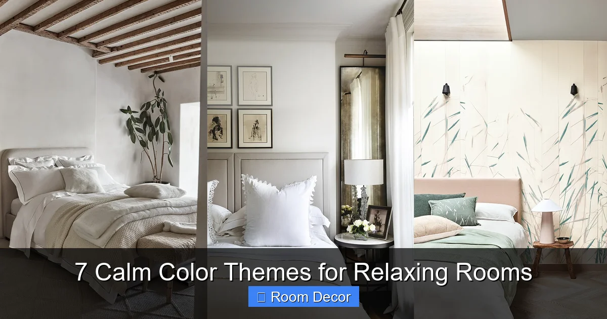
2. Gentle Earth: Warm Neutrals and Natural Greens
Embrace the comforting embrace of nature with the Gentle Earth theme. This palette draws inspiration from lush forests, fertile fields, and warm, sun-baked earth. It’s one of the calm color themes that focuses on grounding hues like sage greens, warm taupes, creamy whites, and hints of terracotta or muted gold, creating a wonderfully organic and serene environment.
Visual guide about 7 Calm Color Themes for Relaxing Rooms
Image source: cdn.mos.cms.futurecdn.net
Establishing Your Foundation
A beautiful sage green or a warm, grey-beige (often called greige) makes an excellent base for this theme. These colors are inherently soothing and connect you to the natural world. They are subtle enough to be dominant without being overwhelming, perfectly fitting the goal of calm color themes.
Layering Earthy Tones
Build upon your base with rich, natural accents. Terracotta pots, rust-colored textiles, or muted gold decorative objects can add warmth and depth. Creamy whites or off-whites provide brightness without starkness, appearing in trim, curtains, or linen bedding. Deeper olive greens or charcoal greys can be introduced sparingly for definition.
Texture and Organic Elements
This theme thrives on natural textures. Think chunky knit wool throws, soft linen upholstery, and jute rugs. Incorporate plenty of organic elements like potted plants (ferns, snake plants, or a fiddle-leaf fig work well), wooden furniture with visible grain, and ceramic pottery. Stone accents or woven baskets further enhance the connection to the earth. These textures make the calm color themes feel tangible and inviting.
Inviting Natural Light
Maximize natural light to make the greens and browns feel vibrant and alive. Use sheer curtains or blinds that allow light to filter in. For artificial lighting, opt for warm, ambient light fixtures – table lamps with fabric shades, floor lamps that cast a soft glow, or even salt lamps can enhance the earthy, calming atmosphere.
3. Lavender Haze: Serene Purples and Cool Greys
The Lavender Haze theme offers a delicate and dreamy atmosphere, reminiscent of a misty morning over a field of blooming lavender. This is one of the most inherently soothing calm color themes, blending soft lavenders with cool greys and creamy whites to create a space that feels utterly tranquil and sophisticated. It’s perfect for bedrooms or meditation spaces.
Visual guide about 7 Calm Color Themes for Relaxing Rooms
Image source: thespruce.com
Selecting Your Soothing Main Shade
A pale, desaturated lavender or a very light grey with a noticeable purple undertone makes an ideal wall color. These shades are gentle on the eyes and promote a sense of calm. The key is to avoid anything too vibrant or sugary; think sophisticated, muted purple, reflecting true calm color themes.
Balancing with Cool and Warm Accents
Pair your lavender base with cool greys for a modern touch – perhaps in a plush rug, throw pillows, or simple drapery. Introduce creamy whites or off-whites for softness and brightness, especially in bedding or sheer curtains. Silver or brushed chrome metallic accents can add a subtle shimmer, while a touch of warm beige or light wood can prevent the space from feeling too cool.
Softness Through Textiles
Indulge in luxurious, soft textiles. Velvet cushions, faux fur throws, silk pillowcases, and high-thread-count cotton sheets will enhance the dreamy quality of the room. A deep-pile carpet in grey or cream will add to the overall comfort and quietness. These textures make the calm color themes feel opulent yet understated.
Creating a Dreamy Glow
Lighting should be soft and diffused. Lamps with fabric shades (especially in cream or grey) will help to create an even, gentle glow. Dimmable switches are a must, allowing you to control the intensity of light. Warm white LEDs (2700K) will complement the cool palette beautifully, preventing it from feeling stark.
4. Misty Morning: Cool Greys and Whispering Blues
Imagine the peaceful calm of a cool, foggy morning, where everything is softened and hushed. The Misty Morning theme captures this serene feeling using a palette of pale greys, cool whites, very light blues, and hints of silver. It’s one of the calm color themes that creates a truly minimalist, refreshing, and incredibly tranquil environment.
Visual guide about 7 Calm Color Themes for Relaxing Rooms
Image source: i.pinimg.com
Grounding Your Room with Grey
A light, cool grey or an off-white with a distinct grey undertone forms the perfect backdrop. These colors are versatile and create a crisp, clean canvas. Avoid dark greys for the primary wall color; the goal is lightness and airiness, characteristic of calm color themes.
Introducing Gentle Blue Tones
Layer in very light, desaturated blues – think sky blue, powder blue, or a barely-there blue-grey. These can appear in upholstered furniture, decorative pillows, or subtly patterned rugs. White is crucial here; use it liberally for trim, ceilings, and perhaps a feature wall to enhance the crispness and brightness.
Crispness and Comfort in Materials
Opt for clean, smooth textures like high-quality cotton, linen blends, and polished finishes. Glass elements, polished chrome, or silver accents (like picture frames or lamp bases) will complement the cool tones. A plush, light-colored rug can add softness and warmth without disrupting the serene aesthetic.
Harnessing Natural and Artificial Light
This theme benefits immensely from abundant natural light. Keep windows minimally dressed with sheer white curtains or blinds that can be easily opened. For artificial lighting, use a mix of ambient and task lighting. Cool white LED bulbs (3500K-4000K) can enhance the crispness during the day, but balance with warmer bulbs (2700K) in lamps for evening relaxation, ensuring the calm color themes remain inviting.
5. Warm Neutral Embrace: Comfort in Creams and Beiges
Sometimes, the most relaxing spaces are those that simply feel like a warm hug. The Warm Neutral Embrace theme is built on a foundation of rich creams, soft beiges, light browns, and muted golds. It’s one of the calm color themes that proves that neutrals are anything but boring; they create a deeply comforting, inviting, and sophisticated atmosphere perfect for unwinding.
The Foundation of Warmth
Start with a cozy base color like a rich cream, a warm beige, or a soft, sandy taupe. These colors are incredibly versatile and provide a feeling of grounded warmth. Ensure your chosen shade has a subtle yellow or red undertone rather than a grey one to maintain that inviting warmth.
Adding Depth with Similar Shades
Build depth by layering similar shades. Introduce slightly darker light browns through wooden furniture, woven baskets, or leather accents. Muted golds can appear in decorative objects, picture frames, or even subtle patterns in textiles. Off-whites or very pale creams keep the space bright and airy, preventing it from feeling too heavy. This layering is key to successful calm color themes.
Rich Textures for Coziness
Texture is paramount for warmth and coziness in this theme. Think chunky knit throws, linen slipcovers, upholstered furniture in a rich cream fabric, and natural wood furniture with visible grain. A plush, high-pile rug in a complementary neutral color will add softness underfoot. Incorporate elements like pottery, distressed wood, and even a touch of brass for subtle gleam.
Enhancing Warmth with Lighting
Lighting should be warm and inviting. Use ambient light sources with warm white bulbs (2700K), such as floor lamps, table lamps, and sconces, to create a soft, all-encompassing glow. Avoid stark overhead lighting. Dimmer switches are ideal for adjusting the mood. Candles or a fireplace (if you have one) will amplify the cozy, embracing feeling of these calm color themes.
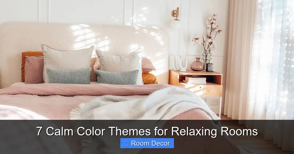
6. Dusty Rose Whisper: Romantic and Relaxing Hues
The Dusty Rose Whisper theme offers a touch of gentle romance and deep relaxation. This isn’t a vibrant, youthful pink, but rather a sophisticated, muted rose, paired with soft greys, creamy whites, and sometimes a hint of sage green. It’s one of the calm color themes that feels both comforting and elegant, creating a wonderfully intimate and serene space.
Embracing the Muted Rose Base
For your primary wall color, choose a desaturated dusty rose or a blush pink that leans towards beige or grey rather than bright pink. These subtle shades evoke warmth without being overwhelming, perfectly aligning with calm color themes. It’s delicate and soothing, perfect for a bedroom or a cozy reading nook.
Complementing with Gentle Neutrals
Balance the rose with soft greys – a light grey rug, grey linen curtains, or accent pillows. Creamy whites or off-whites are essential for brightness and freshness, appearing in bedding, trim, and perhaps an upholstered armchair. A very subtle hint of sage green in a plant or a small decorative item can provide a beautiful, grounding contrast.
Delicate Textures and Feminine Touches
This theme thrives on soft, delicate textures. Consider velvet cushions, matte finishes on furniture, lace details, or floral patterns that are subtle and understated. Smooth, ceramic vases, brushed gold accents, and flowing fabrics like silk or chiffon can enhance the romantic, whisper-soft feel. These textures complement the calm color themes with an added touch of luxury.
Soft, Diffused Illumination
Lighting should be soft, warm, and diffused. Lamps with fabric shades (especially in cream or very pale pink) will cast a gentle glow. Avoid harsh overhead lights. Dimmers are crucial for controlling the ambiance, allowing you to create a serene evening atmosphere. Candles can also enhance the romantic and relaxing mood of this palette.
7. Tranquil Teal: Deep Serenity with Natural Accents
For those who love a deeper, more saturated color without sacrificing calm, the Tranquil Teal theme is ideal. This palette centers around muted teal – a color known for its soothing properties – balanced with warm wood tones, soft greys, and off-whites. It’s one of the calm color themes that creates a rich, sophisticated, and deeply serene atmosphere, reminiscent of deep, tranquil waters.
Anchoring with Muted Teal
A muted teal or a deep, desaturated seafoam green makes a striking yet calming wall color. The key is to choose a shade that has a significant grey undertone, preventing it from feeling too vibrant. This deep color can create a cozy, enveloping feeling, making it one of the powerful calm color themes for relaxation.
Balancing with Earthy and Neutral Tones
To balance the teal, introduce warm wood tones through furniture, flooring, or decorative accents. Soft greys (in rugs, throws, or upholstered pieces) provide a cool contrast without competing. Off-whites or creams are vital for brightness, appearing in trim, ceilings, or crisp bedding. Consider touches of brass or muted gold for a sophisticated sparkle.
Natural and Luxe Textures
Combine natural textures with a touch of luxury. Velvet upholstery in teal or a complementary grey adds depth and richness. Reclaimed wood furniture, rattan accents, and textured jute rugs bring an organic element. Healthy, green plants will pop beautifully against the teal, enhancing the natural, calming vibe. These varied textures ensure the calm color themes feel layered and inviting.
Strategic Lighting for Depth
With a deeper wall color, lighting becomes even more important. Use a mix of ambient and accent lighting. Lamps with opaque shades will prevent glare. Spotlight key features, such as artwork or a plant, to create visual interest. Warm white bulbs (2700K) will ensure the teal looks rich and inviting, rather than cold. Dimmer switches allow you to adjust the intensity, creating a tranquil evening retreat.
Tips for Designing Your Relaxing Room
Now that you’ve explored these calm color themes, here are some overarching tips to ensure your decorating project results in a truly relaxing sanctuary:
Start with an Inspiration Board
Before buying anything, gather images, fabric swatches, and paint chips that resonate with your chosen calm color themes. This helps visualize the overall look and ensures all elements work together cohesively. It’s a crucial first step for any design project.
Test Your Colors
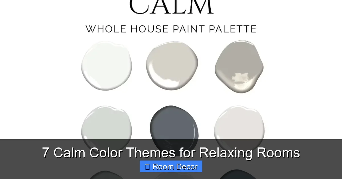
Never paint an entire room based on a small paint chip. Purchase sample pots and paint large swatches (at least 2’x2′) directly onto your walls. Observe them at different times of day and under various lighting conditions. Colors can look dramatically different depending on the light in your specific room, so testing is vital for achieving the desired calm color themes.
Balance Warm and Cool Tones
Even within a largely warm or cool palette, a touch of the opposite can add interest and prevent the room from feeling monolithic. For example, a warm wood floor can ground a cool grey room, or a cool grey accent can modernize a warm beige space. This balance adds sophistication to your calm color themes.
Don’t Forget the Fifth Wall (Ceiling)
While often overlooked, the ceiling plays a significant role. Painting it a slightly lighter shade of your wall color, a soft off-white, or even a very pale version of an accent color can enhance the calm, enveloping feeling. Avoid stark white ceilings if your walls are warm and muted.
Declutter for True Calm
No matter how perfect your calm color themes, a cluttered room will never feel truly relaxing. Prioritize organization and only keep items that bring you joy or serve a purpose. Thoughtful storage solutions can help maintain a tidy and serene environment. Minimalism often goes hand-in-hand with truly relaxing spaces.
Creating a relaxing room is an act of self-care. By thoughtfully selecting calm color themes, layering textures, and paying attention to lighting, you can design a space that truly supports your well-being. Take your time, enjoy the process, and let your home become the peaceful haven you deserve.