Unlock the secret to a tranquil home with our guide to 8 pastel color themes for peaceful rooms. Learn how to transform any space using soft blues, greens, pinks, and yellows, creating serene sanctuaries that promote relaxation and well-being. Discover practical tips to effortlessly infuse your decor with calming hues and create a truly inviting atmosphere, ensuring your rooms feel both peaceful and stylish.
8 Pastel Color Themes for Peaceful Rooms
Are you dreaming of a home where every room feels like a tranquil escape? A place where you can unwind, recharge, and find a sense of calm amidst life’s hustle and bustle? If so, you’re in the right place! Pastel colors are your secret weapon for creating truly peaceful rooms. These soft, muted hues have a magical ability to soothe the mind, reduce stress, and evoke a sense of serenity that few other color palettes can match.
In this comprehensive guide, we’ll dive deep into 8 exquisite pastel color themes designed to transform your living spaces into havens of peace. We’ll explore specific color combinations, discuss the unique moods they create, and provide practical tips on how to implement them in your home decor. Get ready to discover how simple it is to infuse your rooms with the gentle charm and calming energy of pastels, making every corner of your home a testament to tranquility.
Key Takeaways
- Embrace the Power of Pastels: Pastel colors are inherently soft and soothing, making them ideal for creating peaceful rooms that promote relaxation and reduce stress.
- Layering is Key to Depth: To prevent a pastel room from feeling flat, introduce various textures like velvet, linen, knit, and wood. This adds visual interest without sacrificing tranquility.
- Each Theme Offers a Unique Vibe: From the airy calm of Serene Sky to the grounding feel of Earthy Terracotta, each of the 8 pastel color themes provides a distinct atmosphere. Choose one that resonates with your desired mood.
- Strategic Lighting Enhances Serenity: Natural light is a pastel room’s best friend. Supplement with warm, diffused artificial lighting to maintain a soft and inviting glow, avoiding harsh shadows.
- Balance with Neutrals is Essential: Pair your chosen pastel hues with soft neutrals like cream, off-white, light gray, or beige. This provides a grounding effect and allows the pastels to shine without overwhelming the space.
- Personalize Without Clutter: While pastels encourage simplicity, don’t shy away from personal touches. Thoughtfully chosen artwork, plants, or cherished objects can add character while maintaining a peaceful, uncluttered aesthetic.
- Consider the Room’s Purpose: Think about what you do in each room. A bedroom might benefit from cooler, more restful pastels, while a living room could handle a slightly warmer, more inviting pastel palette.
Understanding the Power of Pastels for Peaceful Rooms
Before we explore the specific themes, let’s briefly touch on why pastels are so effective for creating peaceful rooms. Their desaturated nature means they reflect less light and are less stimulating to the eye than vibrant, saturated colors. This inherent softness makes them feel light, airy, and non-threatening, instantly promoting relaxation. They’re often associated with nature – gentle skies, blooming flowers, and tranquil waters – further cementing their connection to peace and serenity. When you choose pastel color themes for peaceful rooms, you’re tapping into a psychology of calm.
Choosing Your Perfect Pastel Color Theme
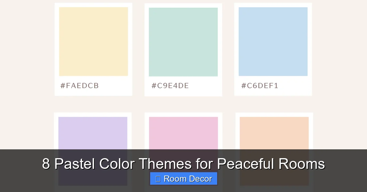
Here are 8 beautiful pastel color themes, each offering a distinct pathway to a more peaceful living space:
Visual guide about 8 Pastel Color Themes for Peaceful Rooms
Image source: pastelcolorpalettes.com
1. Serene Sky & Cloud White
Imagine gazing up at a clear, boundless sky dotted with soft, wispy clouds. This theme brings that expansive, calming feeling directly into your home. It’s one of the most classic and effective pastel color themes for peaceful rooms.
- Color Palette: Soft, muted blues (think sky blue, baby blue, cornflower blue) paired with creamy off-whites or pure whites.
- Vibe & Mood: Airy, tranquil, open, clean, and incredibly refreshing. It promotes mental clarity and reduces feelings of stress, making it perfect for a bedroom or a quiet reading nook.
- Decorating Tips:
- Walls: Paint walls a light sky blue or a warm off-white. If using white, consider a blue accent wall.
- Furniture: Opt for furniture in natural light wood tones or white-washed finishes. Upholstery can be in varying shades of blue or crisp white.
- Textiles: Layer with soft linens, cottons, and even a chunky knit throw in complementary blues or whites. Sheer white curtains will let light filter in beautifully.
- Accents: Introduce subtle silver or chrome accents for a touch of modern elegance. Small touches of green (a plant or two) will also connect to nature.
2. Gentle Mint & Muted Sage
This theme draws inspiration from the gentle tranquility of a secret garden. It’s a fresh and organic choice among pastel color themes for peaceful rooms.
- Color Palette: Pale mint green, soft sage, and muted lime green, often grounded with light wood tones or warm grays.
- Vibe & Mood: Natural, refreshing, healing, and deeply tranquil. This palette brings the restorative power of nature indoors, ideal for creating a sanctuary.
- Decorating Tips:
- Walls: A soft mint or sage green on the walls creates an instant calming backdrop.
- Furniture: Natural wood furniture (light oak, birch) complements these greens perfectly. Cream or beige upholstered pieces can also work well.
- Textiles: Look for fabrics with natural textures like linen, cotton, and hemp. Incorporate botanical prints in subtle patterns.
- Accents: Abundant houseplants are a must! Add natural elements like wicker baskets, pottery, and perhaps a water feature for auditory peace.
3. Blushing Rose & Cream Dream
This theme is all about creating a soft, warm, and inviting hug for your room. It’s wonderfully feminine and comforting.
- Color Palette: Delicate blush pink, soft rose, and muted peach, combined with rich creams, warm beiges, or very light taupes.
- Vibe & Mood: Romantic, comforting, gentle, and nurturing. It’s perfect for a bedroom, nursery, or any space where you want to feel utterly relaxed and cherished.
- Decorating Tips:
- Walls: A pale blush pink wall offers a serene and warm glow. Pair it with cream trim for a classic look.
- Furniture: Cream or off-white upholstered furniture, perhaps with elegant curves, will enhance the romantic feel. Gold or rose gold accents can add a touch of luxury.
- Textiles: Indulge in luxurious textures like velvet throws, silk pillows, and plush sheepskin rugs. Layer different shades of pink and cream.
- Accents: Fresh flowers (roses or peonies), antique-style mirrors, and soft ambient lighting will complete this dreamy aesthetic.
4. Sunny Lemon & Soft Grey
This delightful combination brings a subtle cheerfulness without sacrificing tranquility. It’s a modern twist on pastel color themes for peaceful rooms.
- Color Palette: Very pale lemon yellow or buttery yellow, paired with soft, cool grays or warm light grays.
- Vibe & Mood: Uplifting, gentle energy, subtly cheerful, and quietly sophisticated. It’s excellent for brightening a room without overwhelming it, perfect for a living room or home office.
- Decorating Tips:
- Walls: A light gray wall provides a neutral, grounding base for pops of pastel yellow. You could also do a very pale yellow wall with grey accents.
- Furniture: Modern, clean-lined furniture in gray or white works beautifully. Introduce yellow through accent chairs or cushions.
- Textiles: Use geometric patterns or subtle stripes to add visual interest. Incorporate textiles in various shades of gray and delicate yellow.
- Accents: Matte black or chrome details can add a contemporary edge. Fresh lemons in a bowl provide a natural, fragrant touch.
5. Lavender Haze & Silver Mist
This theme evokes the peaceful feeling of twilight, with its delicate colors and sophisticated undertones.
- Color Palette: Soft lavender, gentle lilac, and muted periwinkle, combined with cool silver grays or light charcoal.
- Vibe & Mood: Soothing, dreamy, sophisticated, and tranquil. Purple pastels are known for their calming properties, making this ideal for a bedroom or meditation space.
- Decorating Tips:
- Walls: A soft lavender on the walls creates an instant serene and almost ethereal atmosphere.
- Furniture: Gray upholstered furniture or white lacquered pieces provide a chic contrast.
- Textiles: Incorporate luxurious fabrics like silk, velvet, or faux fur in shades of lavender, silver, and gray. Think about a weighted blanket in a complementary hue.
- Accents: Silver metallic accents (vases, lamps, picture frames) enhance the “silver mist” effect. Crystals or clear glass elements can add sparkle.
6. Coastal Coral & Sandy Beige
Bring the warmth and relaxation of a gentle beach day into your home with this inviting pastel theme.
- Color Palette: Muted coral, pale peach, and soft terracotta pink, paired with warm sandy beige, cream, or light taupe.
- Vibe & Mood: Beachy, warm, comforting, and relaxed. It’s less overtly blue than traditional coastal themes, offering a softer, more sophisticated warmth.
- Decorating Tips:
- Walls: A warm sandy beige or a very pale, muted coral can set the tone.
- Furniture: Rattan, wicker, and light natural wood furniture are perfect. White slipcovered sofas enhance the relaxed, coastal feel.
- Textiles: Natural fibers like linen and cotton are ideal. Consider stripes or subtle patterns inspired by marine life.
- Accents: Seashells, driftwood, woven baskets, and a few hints of seafoam green or pale aqua can beautifully tie the theme together.
7. Whisper Pink & Aqua Embrace
This playful yet incredibly soothing theme combines two delightful pastels for a refreshing and harmonious space.
- Color Palette: Soft, barely-there pink (whisper pink) with gentle aqua, light teal, or pale turquoise.
- Vibe & Mood: Playful, inviting, harmonious, and surprisingly calm. It’s a fresh take on pastel color themes for peaceful rooms, perfect for a child’s room or a creative space.
- Decorating Tips:
- Walls: Choose one color for the walls (e.g., whisper pink) and use the other as a prominent accent. Or, try a subtle striped or half-painted wall.
- Furniture: White furniture will keep the room feeling light and airy, allowing the pastels to stand out.
- Textiles: Mix and match cushions and throws in both pink and aqua. Use patterns that blend the two colors seamlessly.
- Accents: Introduce clear glass or acrylic elements, and consider whimsical touches like cloud-shaped decor or soft, playful art.
8. Earthy Terracotta & Stone Grey
For a more grounded and organic feel, this theme takes inspiration from natural landscapes, offering a comforting calm.
- Color Palette: Muted, desaturated terracotta (a soft, brownish-orange), paired with warm stone grays or cool light browns.
- Vibe & Mood: Grounding, organic, cozy, and quietly sophisticated. This theme provides a rustic yet refined sense of peace, connecting you to the earth.
- Decorating Tips:
- Walls: A soft stone gray provides a solid, comforting base. Use the pastel terracotta as an accent.
- Furniture: Raw wood furniture, iron accents, or upholstered pieces in natural linen or canvas textures work well.
- Textiles: Chunky knits, wool blankets, and textured rugs in complementary colors will enhance the cozy feel.
- Accents: Hand-thrown pottery, dried grasses, leather elements, and subtle metallic touches (like brushed brass) can elevate this earthy pastel palette.
General Tips for Creating Truly Peaceful Rooms with Pastels
Beyond specific themes, these universal principles will help you maximize the tranquility of your pastel-infused space:
Visual guide about 8 Pastel Color Themes for Peaceful Rooms
Image source: vandelaydesign.com
Layering Textures for Depth
Pastels can sometimes feel flat if not given enough dimension. Combat this by layering various textures. Think soft velvet pillows on a linen sofa, a chunky knit throw over a smooth cotton duvet, or a jute rug on a wooden floor. These tactile differences add visual interest and warmth without introducing jarring colors.
Embracing Natural Light
Natural light is a pastel room’s best friend. It enhances the softness of the colors and makes the space feel larger and airier. Use sheer curtains or blinds that allow light to filter in gently. Avoid heavy, dark drapes that can block out precious sunlight and mute your beautiful pastel hues.
Thoughtful Lighting Choices
When natural light isn’t enough, opt for warm, diffused artificial lighting. Dimmers are fantastic for controlling the mood. Choose lamps with soft shades that cast a gentle glow, rather than harsh overhead lighting. Multiple light sources at different levels can create a cozy and inviting ambiance.
Introducing Subtle Accent Colors
While pastels are the stars, a tiny touch of a slightly deeper, complementary color or a metallic accent can elevate the room. For instance, a small gold frame in a blush pink room or a dark green plant in a mint green space can provide a subtle focal point without breaking the peaceful harmony. Keep these accents minimal and well-integrated.
The Power of Decluttering
No amount of beautiful pastel decor can create a peaceful room if it’s filled with clutter. A clean, organized space is fundamental to a calm mind. Regularly declutter, find appropriate storage solutions, and only keep items that bring you joy or serve a purpose. Simplicity is key to serenity.
Troubleshooting Your Pastel-Decorated Space
Sometimes, even with the best intentions, a pastel room might not feel quite right. Here’s how to address common issues:
Visual guide about 8 Pastel Color Themes for Peaceful Rooms
Image source: i.pinimg.com
“My Pastel Room Feels Too Bland!”
If your peaceful room feels more “boring” than “beautiful,” it often comes down to a lack of texture or contrast.
- Solution: Introduce more varied textures through textiles (velvet, linen, faux fur), rugs, and furniture materials (wood, rattan, metal). You can also add very subtle patterns – a muted floral wallpaper or a geometric throw – to break up large expanses of solid color. A few carefully placed deeper accent colors (like a rich jewel tone in a small vase) can also provide a gentle pop.
“How Do I Prevent My Pastel Room from Looking Childish?”
The key to sophisticated pastels lies in pairing them with mature elements and avoiding overly playful motifs.
- Solution: Choose elegant furniture with clean lines or classic shapes. Opt for more muted, desaturated pastels over vibrant, candy-colored ones. Incorporate metallic accents (gold, silver, copper) or natural materials like dark wood, marble, or stone. Avoid cartoonish artwork or excessive whimsical decor. Focus on refined simplicity.
“Maintaining the Peaceful Vibe When Adding Practical Items”
Functional items like electronics, storage units, or cleaning supplies can disrupt the serene atmosphere.
- Solution: Wherever possible, choose functional items in complementary pastel shades or neutral tones (white, cream, light gray). Hide electronics when not in use, or select sleek, minimalist designs. Use attractive storage solutions like woven baskets, lidded boxes, or closed cabinets to keep everyday clutter out of sight. Everything in your peaceful room should ideally contribute to the overall calm.
Conclusion
Creating truly peaceful rooms using pastel color themes is an art that’s entirely within your reach. From the expansive calm of Serene Sky to the grounding warmth of Earthy Terracotta, each theme offers a unique palette for cultivating tranquility in your home. Remember that the goal is to create a personal sanctuary – a space where you feel calm, comfortable, and completely at ease.
By thoughtfully applying these pastel color themes, embracing layered textures, optimizing natural light, and keeping clutter at bay, you can transform any room into a haven of peace. Don’t be afraid to experiment and adapt these ideas to suit your personal style. Your journey to a more serene and beautiful home starts now. Enjoy the process of designing your very own peaceful pastel oasis!