Transform your living space into a haven of tranquility and timeless elegance with our guide to 10 Soft Warm Neutral Color Themes. This how-to explores the beauty of muted creams, beiges, warm grays, and subtle earthy tones, showing you how to select the perfect palette based on your room’s light and purpose. Learn to layer textures, introduce thoughtful accents, and apply these versatile hues to create inviting, sophisticated, and incredibly comfortable interiors that feel both fresh and familiar.
10 Soft Warm Neutral Color Themes
Welcome to the wonderful world of soft warm neutral color themes! If you’re dreaming of a home that feels like a cozy hug, looks effortlessly chic, and offers a peaceful retreat from the outside world, you’re in the right place. Soft warm neutrals are the unsung heroes of interior design. They provide a calm, versatile backdrop that’s both timeless and incredibly inviting.
This guide will walk you through everything you need to know about embracing these beautiful hues. We’ll explore what makes a color “soft warm neutral,” why they are so beloved, and most importantly, introduce you to 10 distinct soft warm neutral color themes you can use to transform any room in your home. From understanding your room’s light to layering textures and adding the perfect accents, we’ll give you practical tips and inspiration to create spaces that feel uniquely yours – comfortable, stylish, and oh-so-warm.
Key Takeaways
- Versatility & Tranquility: Soft warm neutral color themes offer a foundation for serene, adaptable spaces that feel timeless and inviting, easily paired with various decor styles.
- Importance of Undertones: The key to a successful warm neutral palette lies in identifying and utilizing colors with warm undertones (yellow, red, orange) to avoid a stark or cold feel.
- Texture is Paramount: Since the colors are subdued, layering diverse textures (wood, linen, wool, ceramic, metallics) is essential for adding depth, interest, and coziness to your room.
- Strategic Accentuation: While neutrals dominate, thoughtful accents like natural wood, subtle metallics (brass, bronze), and lush greenery can elevate the space without overwhelming the calm aesthetic.
- Evaluate Light & Purpose: Before selecting a theme, assess your room’s natural light and its intended function, as these factors significantly influence how colors appear and the mood they create.
- Test Before Committing: Always sample paint colors and fabric swatches in your actual room, observing them at different times of day to ensure the chosen theme achieves your desired effect.
Understanding Soft Warm Neutral Color Themes
Before diving into specific themes, let’s clarify what we mean by “soft warm neutral color themes.”
What Are Soft Warm Neutral Colors?
Soft warm neutrals are colors that lack strong saturation but carry a noticeable warm undertone. Think beyond just beige and gray! This category includes:
- Warm Whites & Creams: Whites with hints of yellow, beige, or peach.
- Muted Beiges & Tans: Earthy tones that lean towards yellow or red rather than green.
- Greiges: Grays that have a significant beige or brown undertone.
- Subtle Earth Tones: Very light, muted versions of terracotta, blush, or sage that act as neutrals.
The “soft” part means they aren’t vibrant or overwhelming; they are gentle and understated. The “warm” aspect means they evoke comfort and coziness, as opposed to the crispness of cool neutrals.
Why Choose Soft Warm Neutral Color Themes?
These themes offer a wealth of benefits:
- Timeless Elegance: They never go out of style, providing a sophisticated foundation.
- Versatility: They pair beautifully with almost any accent color or material, allowing for easy updates.
- Calming Atmosphere: They create a serene and tranquil environment, perfect for relaxation.
- Enhanced Space: Lighter neutrals can make a room feel larger and brighter.
- Foundation for Personalization: Your furniture, art, and personal touches truly shine against a soft warm neutral backdrop.
How to Choose Your Perfect Soft Warm Neutral Theme
Selecting the right soft warm neutral color themes for your home isn’t just about picking what looks good in a picture. It’s about understanding your space.
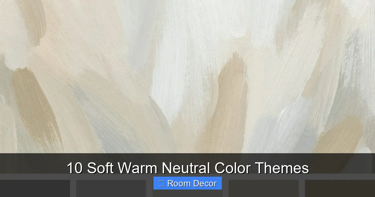
Visual guide about 10 Soft Warm Neutral Color Themes
Image source: media.shilpaahuja.com
Step 1: Define Your Room’s Purpose and Light
Consider the Function
What do you do in this room? A bedroom might benefit from the most soothing soft warm neutral color themes, promoting rest. A living room might lean towards slightly more grounding tones, while a dining room could handle a touch more subtle richness. Consider the mood you want to create.
Evaluate Natural Light
This is crucial! The direction your room faces impacts how colors appear:
- North-Facing Rooms: Often have cooler, indirect light. Warm neutrals are perfect here to prevent the room from feeling chilly.
- South-Facing Rooms: Bathed in bright, warm light. Almost any warm neutral will work, but be aware that very saturated warm tones might feel too intense.
- East-Facing Rooms: Get lovely warm light in the morning, which turns cooler later. Choose a soft warm neutral that looks good in both conditions.
- West-Facing Rooms: Enjoy warm, golden light in the afternoon and evening. Neutrals here will glow beautifully during these hours.
Step 2: Explore the 10 Soft Warm Neutral Color Themes
Now for the exciting part! Here are 10 distinct soft warm neutral color themes to inspire your next home decor project. Each offers a unique feel while maintaining the core principles of warmth, softness, and neutrality.
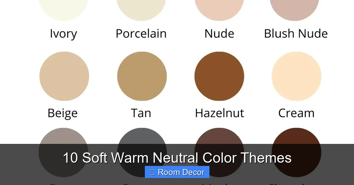
Visual guide about 10 Soft Warm Neutral Color Themes
Image source: i.etsystatic.com
1. Cozy Oatmeal
This theme embodies ultimate comfort. It features a blend of creamy whites, muted beige, and very light, warm greige. It’s like wrapping your room in a soft, knitted blanket.
- Core Colors: Creamy white, soft beige, light greige.
- Accent Colors: Subtle off-white, natural wood tones.
- Feeling: Snug, comforting, serene.
- Key Elements: Chunky knit throws, linen upholstery, light wood furniture, fluffy rugs.
2. Sun-Drenched Sand
Imagine a bright, airy beach house at golden hour. This theme uses pale golden beige, off-white with a hint of yellow, and very faint peach undertones. It’s luminous and inviting.
- Core Colors: Pale golden beige, warm off-white, subtle peach-cream.
- Accent Colors: Rattan, light woven textures, hints of pale blue or green.
- Feeling: Bright, airy, subtly luxurious, tranquil.
- Key Elements: Woven baskets, sheer curtains, bleached wood, natural fibers.
3. Rustic Linen
Inspired by the organic texture and muted tones of natural flax, this theme combines soft taupe, undyed linen colors, and light, earthy brown. It’s grounded and understated.
- Core Colors: Muted flax, soft taupe, pale earthy brown.
- Accent Colors: Distressed wood, matte black, olive green (very muted).
- Feeling: Earthy, organic, calm, timeless.
- Key Elements: Rough-hewn wood furniture, linen drapes, ceramic pottery, vintage finds.
4. Misty Stone
This sophisticated theme draws from the colors of smooth river stones and overcast skies. It blends warm greys (with brown or green undertones), muted sage-green, and a touch of creamy white.
- Core Colors: Warm grey, muted sage, creamy white.
- Accent Colors: Darker charcoal, brushed nickel, deep forest green.
- Feeling: Serene, grounded, subtly modern.
- Key Elements: Concrete accents, wool rugs, minimalist artwork, natural stone.
5. Golden Hour Glow
Capturing the magical light of late afternoon, this theme uses pale butter yellow, warm vanilla, and a soft peach-blush. It’s incredibly welcoming and adds a gentle luminosity to any room.
- Core Colors: Pale butter yellow, warm vanilla, soft peach-blush.
- Accent Colors: Brass, light oak, off-white.
- Feeling: Luminous, gentle, welcoming, cozy.
- Key Elements: Velvet cushions, polished wood, brass accents, ambient lighting.
6. Terra Nude
A sophisticated blend of blush-beige, a whisper of very pale terracotta, and creamy off-white. This theme feels modern, warm, and subtly feminine, without being overtly colorful. It’s one of the most chic soft warm neutral color themes.
- Core Colors: Blush-beige, pale terracotta, creamy off-white.
- Accent Colors: Clay pottery, light leather, warm metallic (copper or rose gold).
- Feeling: Sophisticated, modern, warm, understated elegance.
- Key Elements: Minimalist forms, textured ceramics, linen fabrics, smooth wood.
7. Gentle Graphite
This theme redefines grey as a warm, inviting neutral. It features soft charcoal with a distinct brown or warm grey undertone, complemented by light warm grey and crisp off-white. It’s strong yet gentle.
- Core Colors: Warm charcoal, light warm grey, crisp off-white.
- Accent Colors: Dark wood, black metal, camel leather.
- Feeling: Elegant, grounded, contemporary, masculine touch.
- Key Elements: Felt upholstery, leather accents, sleek furniture, graphic patterns.
8. Woodland Whisper
Inspired by the gentle tones of a serene forest, this theme combines muted sage-green (almost a greige-green), warm cream, and light oak wood tones. It’s incredibly natural and restorative.
- Core Colors: Muted sage-green, warm cream, light oak.
- Accent Colors: Terracotta (muted), moss green, natural branches.
- Feeling: Natural, calming, restorative, earthy.
- Key Elements: Live plants, botanical prints, natural wood furniture, wool textures.
9. Cloud Nine
The epitome of ethereal calm, this theme focuses on the softest, barely-there warm white, a whisper of pale greige, and pure cream. It’s minimalist but never cold, instead feeling incredibly plush and dreamy. This is one of the softest warm neutral color themes.
- Core Colors: Softest warm white, pale greige, pure cream.
- Accent Colors: Silver, very light wood, transparent elements.
- Feeling: Ethereal, minimalist, airy, dreamlike.
- Key Elements: Plush rugs, fluffy cushions, sheer fabrics, smooth surfaces.
10. Desert Bloom
Drawing inspiration from the subtle beauty of a desert landscape, this theme incorporates soft apricot, warm sand tones, and a muted dusty rose. It offers a touch of bohemian chic with inherent warmth.
- Core Colors: Soft apricot, warm sand, muted dusty rose.
- Accent Colors: Terracotta pottery, distressed wood, woven textiles, macrame.
- Feeling: Bohemian chic, exotic, welcoming, unique.
- Key Elements: Textured weaves, pottery, low-slung furniture, global-inspired patterns.
Step 3: Layering and Textures are Key
With soft warm neutral color themes, depth and interest come from variety in texture and subtle layering, rather than bold color contrasts.
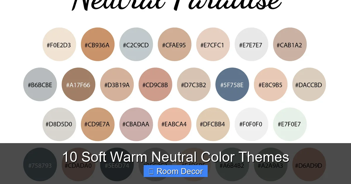
Visual guide about 10 Soft Warm Neutral Color Themes
Image source: i.etsystatic.com
Incorporate Different Textures
Think about combining soft with rough, smooth with chunky. For example, a sleek wooden coffee table paired with a fluffy wool rug, linen curtains, and a ceramic vase. Consider:
- Fabrics: Linen, cotton, wool, velvet, boucle, faux fur.
- Surfaces: Matte wood, polished stone, distressed metal, woven rattan.
- Objects: Pottery, glass, concrete, ceramics.
Add Subtle Patterns
Don’t be afraid of patterns, as long as they stay within your chosen soft warm neutral color themes. Think tone-on-tone stripes, subtle geometric prints, or abstract designs in shades of your core palette. These add visual interest without disrupting the calm feel.
Step 4: Introduce Thoughtful Accents
While the focus is on neutrals, a few well-chosen accents can elevate your soft warm neutral color themes from pleasant to truly captivating.
Wood Tones
Natural wood is a perfect partner for warm neutrals. Vary the types of wood – from light birch to rich walnut – for added depth. Wood furniture, picture frames, and decorative objects bring organic warmth.
Metallic Touches
Warm metals like brass, bronze, and copper beautifully complement soft warm neutral color themes. Use them in lighting fixtures, hardware, mirrors, or small decorative items to add a touch of understated glamour.
Greenery
Plants bring life and a fresh, organic touch. Choose plants with muted green leaves or even subtle variegation. They add a natural pop of color that harmonizes perfectly with the earthy feel of warm neutrals.
Step 5: Test and Adjust
Before committing to an entire room, it’s crucial to test your choices.
Swatch Samples
Paint large swatches directly on your walls (or on poster boards you can move around). Observe them at different times of day and under various lighting conditions. See how they interact with your existing furniture or flooring.
Live with It
Place fabric swatches, wood samples, and accent pieces in the room for a few days. This helps you get a real feel for how the soft warm neutral color themes come together and whether they create the atmosphere you envision.
Practical Tips for Success with Soft Warm Neutral Color Themes
Balance Warmth and Coolness
Even within a warm neutral palette, you can have warmer and slightly cooler elements. A warm beige wall might look great with a slightly cooler, but still warm, grey sofa. This variation prevents the room from feeling monolithic.
Don’t Forget the Fifth Wall (Ceiling)
Painting your ceiling a slightly lighter shade of your wall color, or a soft warm white, can make the room feel taller and more cohesive. Avoid stark white ceilings with warm walls, as this can create a jarring contrast.
Lighting is Crucial
Warm-toned lighting (around 2700K-3000K LED bulbs) will enhance the cozy feel of your soft warm neutral color themes. Avoid cool-toned or daylight bulbs (above 4000K), which can make warm neutrals appear dingy or dull.
Consistency vs. Variety
Aim for consistency in your overall palette, but allow for variety in shades and tones. A room with just one shade of beige can be flat. A room with various creams, beiges, and taupes (all within a warm neutral framework) will feel rich and layered.
Troubleshooting Common Challenges
Even with soft warm neutral color themes, you might encounter a few hurdles. Here are solutions to common issues:
“My Room Feels Bland!”
If your neutral room feels boring, it usually means you need more texture, varying shades, or bolder accents:
- Add More Texture: Introduce a chunky knit throw, a woven rug, a velvet cushion, or a rough-sawn wood piece.
- Vary Your Shades: Use a darker beige sofa with lighter beige walls, or creamy white accents with taupe main elements.
- Introduce Subtle Patterns: A tone-on-tone wallpaper, a rug with a geometric pattern in a similar color, or patterned cushions can add interest.
- Consider a “Pop”: Even one vibrant piece of art or a lush green plant can wake up a room without losing the neutral feel.
“It Looks Too Cold or Clinical!”
This often happens when cool undertones sneak into your palette, or if your lighting is too stark:
- Check Undertones: Ensure your paints and fabrics truly have warm (yellow, red, orange) undertones. If your “greige” looks too gray-blue, it’s not truly warm.
- Warm Up Your Lighting: Switch to LED bulbs in the 2700K-3000K range. Add lamps with fabric shades that diffuse light warmly.
- Bring in Wood: Natural wood tones immediately add warmth.
- Introduce Cream or Blush: Even a few accents in creamy white or a pale blush can soften a cool-leaning neutral room.
“Too Much of the Same Color!”
If everything seems to blend into one flat tone, you need more differentiation:
- Play with Depth: Use lighter versions of your main color for walls, mid-tones for furniture, and darker versions for accessories.
- Layer Textures (Again!): This is the most powerful tool for neutrals. Different textures catch light differently, creating perceived color variation.
- Introduce a Different Neutral: If your room is all beige, try adding elements of a warm grey or a muted cream to break it up.
Conclusion
Embracing soft warm neutral color themes is an investment in creating a home that is not just beautiful, but also deeply comforting and endlessly adaptable. These palettes offer a serene foundation, allowing your personal style and treasured belongings to truly shine. By understanding the nuances of warm undertones, mastering the art of layering textures, and thoughtfully introducing accents, you can create spaces that feel sophisticated, inviting, and uniquely yours.
So, go ahead, explore these 10 soft warm neutral color themes, experiment with swatches, and have fun transforming your home into a sanctuary you’ll love coming back to, day after day. Your cozy, elegant space awaits!