Creating a truly effective study room goes beyond just a desk and a chair; the right colors can dramatically impact your focus and mood. This guide introduces 10 distraction-free color themes for your study room, each carefully selected to promote concentration and a serene learning environment. You’ll learn how to harness color psychology to design a space that naturally reduces distractions, making your study sessions more productive and enjoyable. Get ready to transform your study zone into a calm, inspiring haven.
10 Distraction Free Color Themes for Study Room
Welcome to your ultimate guide for creating the perfect study sanctuary! We all know that a conducive environment is key to effective learning and productivity. But often, we overlook one of the most powerful elements in designing such a space: color. The colors surrounding you can significantly impact your mood, focus, and even your ability to retain information. Imagine a study room that not only looks great but actively helps you concentrate. That’s exactly what we’re going to achieve today!
In this comprehensive guide, you’ll discover 10 incredible distraction free color themes for study rooms, each crafted to minimize visual clutter and maximize your ability to focus. We’ll delve into the psychology behind these choices, provide practical tips for implementation, and help you transform your study area into a haven of concentration. Get ready to learn how to choose and apply the perfect study room colors that work for *you*.
Key Takeaways
- Understand Color Psychology: Learn how specific colors can influence mood, focus, and energy levels in your study room, guiding you to make informed design choices.
- Prioritize Neutrals and Cool Tones: Distraction-free color themes for study rooms often lean on soothing neutrals (grays, beiges, creams) and calming cool tones (blues, greens, purples) to promote concentration and reduce visual clutter.
- Emphasize Simplicity and Minimalism: A key principle for a distraction-free study space is keeping the color palette simple and avoiding overly bright or complex patterns that can divert attention.
- Balance Core and Accent Colors: Choose one primary calming color for walls and larger surfaces, then introduce subtle accent colors through textiles, decor, or small furniture pieces to add depth without overwhelming the senses.
- Integrate Natural Elements: Pairing your chosen color theme with natural light, wood textures, and a touch of greenery can significantly enhance the serene and focused atmosphere of your study room.
- Consider Lighting Carefully: Proper lighting, both natural and artificial (warm white light is often preferred), works in harmony with your color theme to prevent eye strain and maintain alertness without causing harshness.
- Personalize Within Limits: While staying within distraction-free guidelines, feel free to add personal touches that resonate with you, ensuring your study room feels inviting and inspiring, not just functional.
Understanding Color Psychology for a Distraction-Free Study Room
Before diving into specific themes, let’s briefly touch upon why certain colors work better than others for a study environment. Our brains react to colors in various ways, influencing emotions, energy levels, and cognitive functions.
Cool Tones for Calm and Focus
Colors like blues, greens, and purples are generally considered cool tones. They tend to evoke feelings of calm, tranquility, and stability.
- Blues: Often associated with serenity, peace, and intelligence. Light blues can promote clear thought and reduce stress.
- Greens: Linked to nature, balance, and harmony. Green can reduce eye strain, create a refreshing feel, and improve concentration.
- Purples (Lavender/Lilac): Lighter shades of purple can be inspiring, calming, and encourage creativity without being overly stimulating.
Neutrals for Stability and Minimalism
Grays, whites, creams, and beiges are versatile neutral colors. They provide a stable, unobtrusive backdrop, allowing your mind to focus on tasks rather than visual stimuli.
- Grays: Sophisticated and balanced, grays can promote a sense of calm and professionalism. Warmer grays (greige) can add coziness.
- Whites/Creams: Clean, pure, and spacious. While stark white can feel clinical, off-whites and creams offer softness and warmth while still being minimalist.
- Beiges/Taupes: Earthy and comforting, these colors create a grounding and stable environment, fostering a relaxed yet attentive state.
Avoiding Overly Stimulating Colors
While warm colors like reds, oranges, and bright yellows can be energizing, they are generally not ideal as primary colors for a distraction-free study room. They can be too stimulating, potentially leading to restlessness or anxiety. Small, strategic accents might work, but the overall palette should remain subdued.
General Principles for Distraction-Free Study Room Colors
No matter which theme you choose, keep these general principles in mind for your study room:
Keep it Simple
Less is often more when it comes to a study space. Avoid too many different colors or complex patterns on large surfaces. A simple palette promotes a clear mind.
Visual guide about 10 Distraction Free Color Themes for Study Room
Image source: newszii.com
Embrace Natural Light
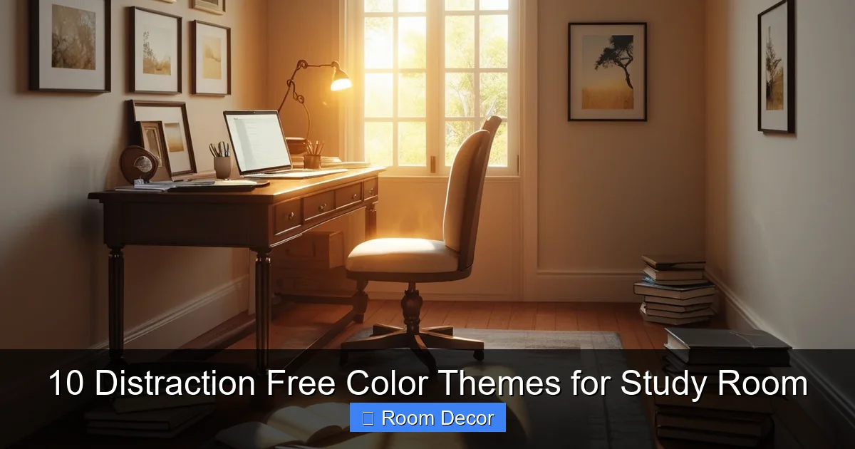
Natural light is the best light for studying and working. It reduces eye strain and helps maintain a healthy sleep cycle. Ensure your chosen colors complement and enhance the natural light in your room.
Think About Texture
While colors are key, texture adds depth without being distracting. Think about a textured rug, a linen curtain, or a wooden desk. These elements can make a monochromatic room feel rich and inviting.
Declutter for Clarity
No color theme, however perfect, can overcome a cluttered space. A tidy room is a tidy mind, so regularly declutter your study area.
The 10 Distraction Free Color Themes for Study Room
Now, let’s explore these themes designed to create the ultimate focus zone. Each theme includes a primary color and suggested accent colors to complete the look.
1. Serene Sage Green & Cream
Mood: Calm, Refreshing, Balanced

Visual guide about 10 Distraction Free Color Themes for Study Room
Image source: cdn0.iconfinder.com
Sage green is a muted, earthy green that brings the tranquility of nature indoors without being overpowering. Paired with soft cream, it creates a wonderfully soothing and distraction-free environment.
- Primary Color: Sage Green (walls, main furniture)
- Accent Colors: Cream, Off-White, Light Wood Tones
- Why it Works: Green is known to reduce eye strain and promote focus. Sage green is particularly calming, helping to alleviate stress and create a refreshing atmosphere. Cream adds softness and warmth.
- Implementation Tips: Paint your walls a gentle sage. Use cream for curtains, a rug, or shelving. Incorporate natural light wood for your desk and shelves. A few small plants would perfectly complement this theme.
2. Tranquil Soft Blue & White
Mood: Peaceful, Clear-headed, Expansive
Light blue shades are excellent for promoting clear thought and reducing anxiety. When combined with crisp white, this theme creates an airy, spacious, and highly focused atmosphere.
- Primary Color: Soft Sky Blue or Powder Blue (walls)
- Accent Colors: Crisp White, Light Gray, Silver
- Why it Works: Blue is often associated with intelligence, calm, and stability. Soft blues are not stimulating, helping the mind to settle and concentrate. White keeps the space bright and clean.
- Implementation Tips: Paint walls a light blue. Use white for trim, a bookcase, or a desk. A light gray chair or silver lamp could add subtle contrast. Keep decor minimal to maintain the airy feel.
3. Warm Greige & Natural Wood
Mood: Grounding, Cozy, Sophisticated
Greige (a blend of gray and beige) is a wonderfully versatile neutral that offers the best of both worlds: the modern edge of gray with the warmth of beige. Paired with natural wood, it creates a highly inviting yet focus-driven space.
- Primary Color: Warm Greige (walls, large rug)
- Accent Colors: Natural Oak, Walnut, Cream, Charcoal Gray
- Why it Works: Greige is incredibly calming and provides a stable backdrop, allowing the mind to concentrate without visual distractions. Natural wood adds an organic touch, enhancing comfort and reducing sterile feelings.
- Implementation Tips: Paint walls a warm greige. Opt for a solid wood desk and shelving. Use cream or off-white for linens or a cozy throw. Charcoal gray could be used for an office chair or a small accent.
4. Peaceful Pale Lavender & Silver
Mood: Creative, Relaxing, Serene
Pale lavender offers a touch of gentle color that can spark creativity while maintaining a deeply calming atmosphere. Combined with subtle silver accents, it feels sophisticated and tranquil.
- Primary Color: Very Light Lavender or Lilac (walls, accent wall)
- Accent Colors: Soft Gray, Silver, Creamy White
- Why it Works: Light purples are known to be calming and can foster creativity and introspection without being overstimulating. Silver adds a modern, sophisticated touch that reflects light beautifully.
- Implementation Tips: A pale lavender accent wall behind your desk can be impactful. Keep other walls creamy white or light gray. Use silver for lamp bases, picture frames, or a sleek monitor stand.
5. Earthy Taupe & Beige
Mood: Grounding, Natural, Unobtrusive
For those who love a warm, natural feel without bright colors, earthy taupe and beige are perfect. This theme creates a deeply grounding and stable study environment, reminiscent of natural landscapes.
- Primary Color: Taupe (walls)
- Accent Colors: Beige, Cream, Terracotta (subtle), Dark Wood
- Why it Works: Taupe and beige are incredibly neutral and non-distracting. They provide a sense of stability and warmth, helping you feel rooted and focused without any visual noise.
- Implementation Tips: Paint walls taupe. Use beige for a comfortable chair or rug. Dark wood furniture (like a mahogany desk) would look rich against these tones. A small terracotta pot for a plant could add a subtle, natural accent.
6. Muted Teal & Off-White
Mood: Balanced, Focused, Contemporary
Muted teal is a sophisticated blend of blue and green, offering the best of both worlds: the clarity of blue and the refreshing quality of green. Paired with soft off-white, it creates a modern yet utterly distraction-free study room.
- Primary Color: Muted Teal (accent wall, specific furniture)
- Accent Colors: Off-White, Light Gray, Metallic Bronze
- Why it Works: Teal can stimulate clear thought and calm the senses simultaneously. Its muted form prevents it from being too vibrant, ensuring focus. Off-white keeps the space bright and airy.
- Implementation Tips: Consider painting one wall in muted teal, or use teal in a statement piece like a comfortable armchair. Keep other walls off-white. Light gray textiles and subtle bronze desk accessories would complete the look beautifully.
7. Light Olive & Stone
Mood: Organic, Serene, Reflective
Light olive green is a subtle, sophisticated green that evokes nature and calm. When combined with stone gray, it creates a robust, organic, and truly peaceful study space, ideal for deep concentration.
- Primary Color: Light Olive Green (walls)
- Accent Colors: Stone Gray, Cream, Black (minimal), Raw Wood
- Why it Works: Olive green is grounding and reduces eye fatigue, while stone gray adds a strong, stable foundation. This combination feels incredibly natural and promotes a quiet, reflective atmosphere.
- Implementation Tips: Paint walls light olive. Use stone gray for a rug, chair, or filing cabinet. Cream-colored sheer curtains and a black desk lamp would add clean lines. Incorporate raw wood shelves for an extra organic touch.
8. Minimalist Greige & Black Accents
Mood: Modern, Crisp, Highly Focused
For those who prefer a more stark, modern aesthetic, a minimalist greige base with strategic black accents can be incredibly effective. This theme strips away all unnecessary visual elements, leaving only what’s essential for focus.
- Primary Color: Light Greige (walls, large surfaces)
- Accent Colors: Black, Pure White (minimal), Stainless Steel
- Why it Works: Greige provides a soft, neutral base that doesn’t distract. Black accents, used sparingly, define space and add sophistication without visual noise, promoting a sharp, no-nonsense focus.
- Implementation Tips: Paint walls and ceiling light greige. Opt for a sleek black desk chair, a black desk lamp, or black picture frames. Keep other elements white or stainless steel. The key here is *minimalism*.
9. Subtle Mint & Light Gray
Mood: Fresh, Stimulating (gently), Optimistic
Subtle mint green is a wonderfully fresh color that can gently stimulate the mind without being overwhelming. Paired with light gray, it creates a bright, airy, and quietly optimistic study environment.
- Primary Color: Subtle Mint Green (accent wall, decor)
- Accent Colors: Light Gray, White, Blonde Wood
- Why it Works: Mint green offers the refreshing qualities of green in a very soft, soothing hue. It can gently uplift mood and reduce feelings of sluggishness, while light gray provides a balancing, neutral base for focus.
- Implementation Tips: Use light gray for most walls, and a subtle mint green for an accent wall or smaller decor items like storage boxes or a cushion. White or blonde wood furniture would enhance the fresh feel.
10. Cream & Soft Terracotta
Mood: Warm, Grounding, Comforting
This theme is perfect if you crave a touch of warmth but still need a distraction-free space. Cream forms the gentle base, while very soft, muted terracotta accents provide an earthy, comforting feel without being too stimulating.
- Primary Color: Cream or Off-White (walls)
- Accent Colors: Muted Terracotta, Light Wood, Burnt Orange (very subtle)
- Why it Works: Cream is incredibly soothing and versatile, making the room feel spacious and calm. Soft terracotta adds an earthy, grounding warmth that can make a space feel cozy and secure, promoting sustained focus.
- Implementation Tips: Paint walls a warm cream. Use muted terracotta for a decorative vase, a small throw blanket, or a few art prints. Light wood furniture would perfectly complement this natural palette. Avoid bright, vibrant terracotta; opt for muted, dusty tones.
Practical Tips for Applying Your Chosen Theme
Once you’ve picked your ideal distraction free color themes for study room, here’s how to bring it to life effectively:
Start with Swatches
Never commit to a paint color based solely on an online image or a small chip. Buy several sample pots and paint large swatches on your walls. Observe them at different times of day to see how natural and artificial light affects them.

Visual guide about 10 Distraction Free Color Themes for Study Room
Image source: wallpapercave.com
Consider Existing Elements
Do you have a beloved desk, a large bookcase, or flooring that you can’t change? Choose a theme that complements these existing elements rather than clashing with them.
Layer Textures, Not Just Colors
To prevent your room from feeling sterile or bland, introduce different textures. Think about a soft wool rug, linen curtains, a woven storage basket, or a smooth wooden desk. These layers add interest without adding visual noise.
Strategic Lighting is Crucial
Beyond natural light, choose artificial lighting carefully. Warm white LED bulbs (around 2700K-3000K) are generally recommended for study areas as they are less harsh than cool white light and promote comfort without drowsiness. Ensure you have good task lighting for your desk.
Don’t Forget the Floor
Your flooring color plays a big role. If you have dark flooring, lighter wall colors can balance it out. If your floor is light, you might introduce slightly deeper tones in your furniture or rug.
Troubleshooting Common Challenges
Even with the best intentions, you might encounter a few hurdles. Here’s how to address them:
“My room feels too sterile or boring.”
Solution: You might have gone *too* minimalist. Introduce textures (a woven rug, a soft throw), a few well-placed plants, or a piece of art with a subtle, calming pattern. Natural wood elements also add warmth. Even a carefully chosen desk accessory can break the monotony.
“It feels too dark or gloomy.”
Solution: This often happens if the primary color is too saturated or if there isn’t enough natural or artificial light. Consider using lighter accent colors, adding more reflective surfaces (a mirror, metallic accents), or upgrading your lighting fixtures to provide more ambient light.
“I’m still getting distracted easily.”
Solution: Re-evaluate your space for clutter, even small items. Is your desk clear? Are there too many personal photos or knick-knacks? The color theme sets the stage, but maintaining a tidy physical space is paramount for a distraction-free study room.
“I get bored with the color after a while.”
Solution: Choose a highly neutral primary color (like greige or cream) for the walls. Then, use easily changeable accents (cushions, throws, desk organizers, small art) in your preferred calming accent colors. This allows you to refresh the look without a full repaint.
Conclusion
Creating a truly distraction free color themes for study room is a powerful step towards unlocking your full potential. By thoughtfully selecting your study room colors, you’re not just decorating; you’re actively designing an environment that supports your cognitive functions, reduces stress, and fosters deep concentration.
Whether you lean towards the serene greens, the calming blues, or the grounding neutrals, the key is to choose a palette that resonates with you and promotes a sense of peace and focus. Experiment with swatches, embrace natural elements, and remember that simplicity is your greatest ally. Go forth and transform your study space into the productive haven you deserve!