
Choosing the best color for a small kitchen is key to creating an illusion of space and brightness. Light, cool hues like whites, soft greys, and pale blues are often ideal, as they reflect light and recede visually. Focus on a cohesive palette to make your compact kitchen feel larger, more open, and truly inviting, ensuring every element works together for the optimal spacious feel.
Key Takeaways
- Embrace Light Colors: The #1 rule for small kitchens is to use light colors. They reflect light, making the space feel significantly larger and brighter.
- Prioritize Cool Tones: Cool colors like blues, greens, and grays tend to recede visually, creating an illusion of depth and openness. Warm colors, while inviting, can make a small space feel cozier and thus smaller.
- Understand Undertones: The subtle undertones in a paint color (e.g., yellow, blue, green) dramatically impact how it looks in your specific lighting and alongside existing elements. Always test samples!
- Think Monochromatically: Using variations of a single color or closely related shades creates a seamless flow from walls to cabinets, making the kitchen feel less cluttered and more expansive.
- Consider All Surfaces: The “best color for a small kitchen” isn’t just about walls. Cabinets, countertops, backsplashes, and even flooring play a vital role in the overall perception of space and light.
- Strategic Accent Use: While light colors dominate, a judicious pop of a brighter or darker accent color through accessories can add personality without overwhelming the small footprint.
- Test in Your Space: Always paint large swatches of your chosen colors on different walls and observe them throughout the day under various lighting conditions before making a final decision.
Introduction: Unleash the Power of Color in Your Small Kitchen
Having a small kitchen can feel like a design challenge. You want it to be functional, beautiful, and most importantly, feel as spacious as possible. The good news? You don’t need a sledgehammer to achieve this! One of the most powerful and cost-effective tools you have is color. Choosing the right paint can completely transform your compact cooking area, making it feel airy, bright, and wonderfully inviting.
But with endless swatches and shades, how do you pick the best color for a small kitchen? It’s more than just picking a pretty hue; it’s about understanding how color interacts with light, perception, and the overall feel of your home. In this comprehensive guide, we’ll walk you through everything you need to know, from foundational color theory to specific paint recommendations, ensuring your small kitchen becomes a big design success story.
Step 1: Understand the Goal – What Are We Trying to Achieve?
Before diving into specific colors, let’s clarify our primary objectives. In a small kitchen, we’re not just decorating; we’re performing visual magic.

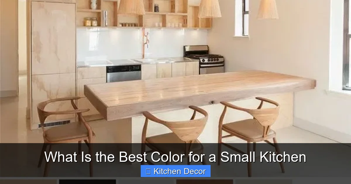
Visual guide about What Is the Best Color for a Small Kitchen
Image source: roomfortuesday.com
Making It Feel Larger, Not Just Brighter
Our main goal is to create an illusion of increased space. Light colors naturally recede, making walls appear further away than they are. They also reflect light, which brightens the room. A brighter room feels more open and less confined. Think of it as opening up the space without actually knocking down any walls.
Creating an Inviting and Functional Space
Beyond spaciousness, your kitchen needs to feel welcoming. Color impacts mood significantly. We want a palette that inspires cooking, fosters conversation, and makes you genuinely enjoy being in the room. Functionality also plays a role; practical considerations like ease of cleaning and how well the color hides minor scuffs should be part of the decision for the best color for a small kitchen.
Step 2: The Core Principles of Color for Small Spaces
Understanding these basic color principles will empower you to make informed decisions for your compact kitchen.
Visual guide about What Is the Best Color for a Small Kitchen
Image source: smallroomdecor.com
Light Reflection is Your Best Friend
This is arguably the most crucial principle. Light colors have a higher Light Reflectance Value (LRV), meaning they bounce more light around the room. This makes the space feel larger and more open. Darker colors absorb light, which can make a small room feel enclosed and cave-like. For a small kitchen, aim for colors with an LRV of 60 or higher.
Cool vs. Warm Tones: Understanding Their Impact
- Cool Tones: Colors like blues, greens, and purples are considered cool. They tend to visually “recede,” meaning they make walls feel further away. This quality is incredibly beneficial in a small kitchen, contributing to an expansive feel.
- Warm Tones: Colors like reds, yellows, and oranges are warm. They tend to “advance,” making surfaces feel closer. While warm colors can be cozy, they can also make a small room feel even smaller if not used carefully.
Generally, cool tones are preferred when seeking the best color for a small kitchen, though specific warm whites can work well too.
The Magic of Monochromatic and Analogous Palettes
When selecting the best color for a small kitchen, simplicity is key. A monochromatic scheme uses different shades, tints, and tones of a single color. An analogous palette uses colors next to each other on the color wheel (e.g., light blue and light green). Both approaches create a cohesive, seamless look, preventing the space from feeling choppy or cluttered, which can exacerbate the feeling of smallness. Keeping a consistent color flow from walls to cabinets helps blur boundaries.
Step 3: Discovering the Best Color Families for Small Kitchens
Now that we understand the principles, let’s explore the color families most effective in making a small kitchen shine.
Visual guide about What Is the Best Color for a Small Kitchen
Image source: eatwell101.com
Bright Whites: The Ultimate Expander
White is the perennial champion for small spaces. It reflects the maximum amount of light, instantly making a room feel expansive, clean, and fresh. There’s a reason it’s often cited as the best color for a small kitchen.
- Pure White: Crisp and straightforward, perfect for a modern, minimalist look. Be aware it can sometimes feel stark if not balanced with textures or warmer accents.
- Examples: Benjamin Moore Chantilly Lace, Sherwin-Williams Extra White.
Warm Whites and Off-Whites: Softening the Edges
If pure white feels too stark, warm whites and off-whites are fantastic alternatives. These colors have subtle undertones (yellow, beige, or even a hint of pink) that prevent them from feeling cold, adding warmth and coziness without sacrificing the illusion of space.
- Cream/Ivory: Softer than pure white, these shades provide a welcoming glow. They pair beautifully with natural wood elements.
- Beige-Whites/Greige-Whites: These offer more depth than pure white, providing a neutral backdrop that’s still light and airy. “Greige” (a mix of gray and beige) is incredibly versatile.
- Examples: Sherwin-Williams Alabaster, Benjamin Moore Swiss Coffee, Sherwin-Williams Accessible Beige, Benjamin Moore Classic Gray.
Soft Greys: Sophistication with Space
Light grays are incredibly popular for small kitchens because they offer a sophisticated, modern alternative to white while still promoting spaciousness. They often have cool undertones that help walls recede.
- Light Silver Grays: These can have subtle blue or green undertones, enhancing the cool, expansive effect.
- Greige: As mentioned, greige is a fantastic compromise, offering the warmth of beige with the modernity of gray. It’s often considered the best color for a small kitchen when you want a neutral that isn’t white.
- Examples: Sherwin-Williams Repose Gray, Benjamin Moore Gray Owl, Farrow & Ball Pavilion Gray.
Pale Blues and Greens: Serenity and Illusion of Depth
These cool colors are excellent choices because they naturally recede, making walls feel further away. They also evoke feelings of calm and nature, perfect for a soothing kitchen environment.
- Sky Blue/Light Teal: Creates a light, airy, almost ethereal feel, reminiscent of the open sky.
- Mint Green/Seafoam Green: Fresh, clean, and subtle, these greens bring a touch of nature indoors without being overpowering. They’re particularly refreshing for a small kitchen.
- Examples: Sherwin-Williams Sea Salt, Benjamin Moore Palladian Blue, Farrow & Ball Teresa’s Green.
Pastels and Muted Hues: A Touch of Personality
If you crave a bit more color than pure neutrals, very light, muted pastels can work. The key is “very light” and “muted.” Think of pastel yellows, blush pinks, or light lavenders. These add personality without making the room feel cramped, especially when paired with plenty of white. Ensure they have a high LRV.
A soft, buttery yellow can make a small kitchen feel sunny and warm without advancing too much, especially if it has a good LRV.
Step 4: Dive Deeper – Undertones and Lighting Considerations
This is where color selection becomes an art. Ignoring undertones and lighting can lead to unexpected and often disappointing results.
The Subtle Power of Undertones
Every paint color, even white or gray, has an undertone. This is the subtle hint of another color within it. An off-white might have a yellow, pink, or gray undertone. A gray might have a blue, green, or purple undertone. These undertones interact with your kitchen’s existing elements (cabinets, countertops, flooring, appliances) and lighting.
- Warm Undertones (yellow, red): Can make a color feel cozier but can also clash with cool-toned fixed elements or make a small space feel busier.
- Cool Undertones (blue, green): Often desirable for small kitchens as they enhance the receding effect.
Always consider how your chosen paint’s undertone will play with your existing fixtures. For instance, a gray with a green undertone might look fantastic next to dark wood cabinets but clash with a countertop that has a pink undertone.
Natural vs. Artificial Light: A Game Changer
The type and amount of light your kitchen receives will dramatically alter how any paint color appears.
- North-Facing Rooms: Receive cooler, bluish light. Warm whites or colors with warm undertones can help balance this coolness and prevent the space from feeling too chilly.
- South-Facing Rooms: Bathed in warm, bright light throughout the day. Almost any color looks good here, but cooler tones can help temper the intensity if needed.
- East-Facing Rooms: Get warm, bright light in the morning, which turns cooler later in the day. Colors may appear different throughout the day.
- West-Facing Rooms: Receive warm, intense light in the afternoon and evening. Cooler colors can help balance this strong warmth.
- Artificial Light: Pay attention to the color temperature of your light bulbs. Warm white bulbs (2700K-3000K) can bring out yellow or red undertones, while cool white bulbs (4000K-5000K) can enhance blue or green undertones. For the best color for a small kitchen, ensure your lighting complements your chosen hue.
Step 5: Beyond the Walls – Incorporating Color Cohesively
The walls are just one piece of the puzzle. For a small kitchen, a cohesive color strategy across all surfaces is paramount to achieving that spacious feel.
Cabinets: The Biggest Color Statement
In most kitchens, cabinets take up the most visual real estate. For small kitchens, light-colored cabinets are almost always the best color for a small kitchen strategy.
- White or Off-White Cabinets: These are classic for a reason. They reflect light, look clean, and create a seamless backdrop, making the kitchen feel more open.
- Light Gray or Pale Blue/Green Cabinets: Offer a gentle break from white while still maintaining a bright, airy feel.
- Tip: Consider going floor-to-ceiling with cabinets if possible. This draws the eye upward, making the room feel taller. Keep them light-colored for maximum impact.
Countertops and Backsplash: Function and Flair
These elements should complement your wall and cabinet colors without introducing too much visual clutter.
- Light-Colored Countertops: White, light gray, or subtle speckled patterns help reflect light and maintain an open feel. Materials like quartz or light granite can be excellent.
- Reflective Backsplash: Subway tiles, glass tiles, or highly reflective ceramic tiles can further bounce light around. Choose light colors, ideally matching or coordinating closely with your wall or cabinet color for a seamless look.
Flooring: Grounding the Space
Your flooring choice also affects the perception of space.
- Light-Colored Flooring: Light woods, light-colored tiles, or even white/light gray vinyl can expand the room.
- Consistent Flooring: If possible, extend the same flooring from your kitchen into adjacent rooms. This creates a continuous sightline, making both spaces feel larger.
Appliances: Integrated or Contrasting?
For a small kitchen, integrated or panel-ready appliances that blend with your cabinetry can create a more streamlined, less cluttered look. Stainless steel is a popular choice for its reflective qualities, but white appliances can also disappear into light cabinetry.
Step 6: Don’t Overlook Accent Colors and Textures
While light and cool colors form the foundation of the best color for a small kitchen, thoughtful accents prevent the space from feeling bland or sterile.
Strategic Pops of Color
A small kitchen can handle small, strategic bursts of color. Think about:
- Accessories: Colorful dishtowels, a vibrant fruit bowl, a collection of brightly colored cookbooks, or a small plant pot.
- Art: A small piece of art on an unused wall can add personality.
- Open Shelving: Displaying a few colorful ceramics or glassware can add visual interest without overwhelming.
The key here is *restraint*. Too many different accent colors or too much visual noise will negate the spaciousness you’ve worked hard to create.
Adding Texture for Interest
Texture adds depth and warmth without adding “color” in the traditional sense. This is especially important if you’ve opted for an all-white or all-gray scheme.
- Natural Wood: A wooden cutting board, floating shelves, or even a small wooden stool can introduce warmth.
- Metallics: Copper, brass, or brushed nickel hardware and light fixtures add subtle shine and sophistication.
- Fabrics: A Roman blind or a textured rug (if space allows) can bring softness.
Step 7: The Crucial Step – Testing Your Color Choices
You’ve done your research, considered your kitchen’s unique characteristics, and narrowed down your options. Now comes the most important practical step before you buy gallons of paint.
Gather Samples
Buy sample pots of your top 2-3 color choices. Don’t skip this step! What looks perfect on a small chip in the store can look entirely different on your wall.
Observe in Different Lighting
Paint large swatches (at least 2’x2′) directly onto your kitchen walls, or use large poster boards if you prefer not to paint directly. Paint swatches on different walls, as lighting varies even within the same room.
Observe these swatches throughout the day – morning, noon, and evening. See how they look under natural light and then under your kitchen’s artificial lighting. This will reveal the true character and undertones of each color in your specific environment, helping you determine the best color for a small kitchen.
Live with It for a Few Days
Don’t rush the decision. Allow yourself a few days to live with the samples. This helps you get a real feel for how the color impacts the mood and perceived size of your kitchen. Ask for opinions from family members too!
Troubleshooting Common Small Kitchen Color Challenges
“My Kitchen Feels Too Clinical/Cold!”
If you’ve gone with a pure white or cool gray and find it a bit sterile, don’t despair! Introduce warmth through:
- Wood Elements: Cutting boards, open shelving, a small dining table.
- Warm Metals: Brass or copper hardware and lighting fixtures.
- Soft Textures: A woven rug, fabric window treatment, or even a few decorative towels.
- Subtle Warm Accents: A bowl of lemons, a small plant, or a piece of colorful art.
“I Love Dark Colors, But My Kitchen is Tiny!”
You can still incorporate dark colors, but with caution and strategy:
- Lower Cabinets Only: Paint just the lower cabinets a dark color and keep upper cabinets and walls light. This grounds the space without overwhelming it.
- One Accent Wall (Very Carefully): If you have one wall with very little cabinet space, you *might* get away with a dark accent color, but ensure the other three walls are very light and the space receives ample light. This is a riskier move in truly tiny kitchens.
- Small Details: Use dark colors in small doses, like a dark backsplash tile with light grout, dark hardware, or a dramatic light fixture.
“What if My Kitchen Has No Natural Light?”
This is a common challenge! Maximize artificial light with bright, well-distributed fixtures. Stick to the lightest possible colors (pure whites, high-LRV off-whites, very pale blues/greens) to reflect as much artificial light as possible. Consider reflective surfaces for backsplashes and countertops to bounce light around even more. Avoid any color that feels heavy or dull.
Conclusion: Your Small Kitchen, Brilliantly Transformed
Choosing the best color for a small kitchen is a journey that blends aesthetic preference with smart design principles. By prioritizing light-reflecting, cool-toned hues, understanding undertones, and considering all surfaces from walls to cabinets to floors, you can create a compact kitchen that feels far more expansive and inviting than its actual square footage suggests.
Remember, your kitchen is the heart of your home. Take your time, test your choices, and trust your instincts. With these guidelines, you’re well-equipped to select a color that not only looks stunning but also functionally enhances your small kitchen, making it a space you’ll love for years to come. Happy painting!