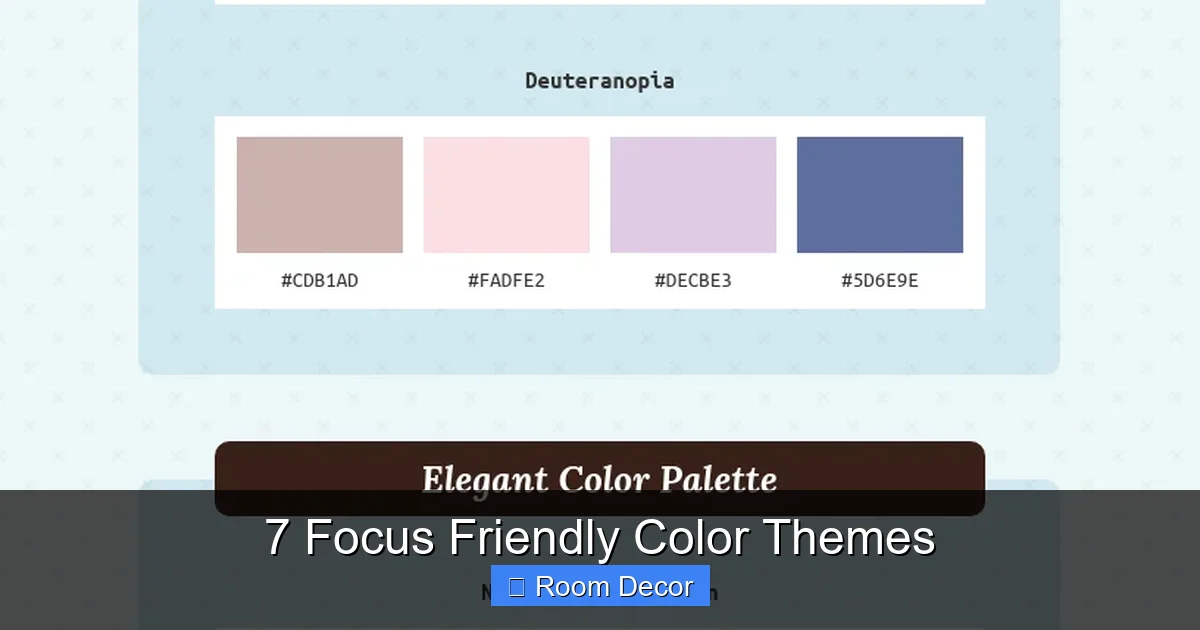
Designing a space that promotes focus and productivity is key to achieving your goals. This guide unveils 7 focus friendly color themes, carefully chosen for their psychological benefits in enhancing concentration and reducing distractions. Learn how to apply these calming and grounding palettes to your room decor, creating an environment where your mind can thrive without unnecessary visual clutter, ultimately boosting your efficiency and well-being.
7 Focus Friendly Color Themes
Welcome, fellow seekers of serenity and productivity! Have you ever walked into a room and immediately felt a sense of calm, or perhaps a sudden burst of energy? That’s the magic of color psychology at play. In our fast-paced world, creating a personal sanctuary that supports our mental clarity and concentration is more crucial than ever. Whether you’re setting up a home office, a dedicated study nook, or simply want to infuse your living space with a more mindful vibe, choosing the right color theme can make all the difference.
This comprehensive guide will walk you through 7 focus friendly color themes designed specifically to enhance concentration, reduce stress, and foster a productive environment. We’ll explore why certain colors work, how to apply them effectively in your room decor, and offer practical tips to transform your space into a hub of unwavering focus. Get ready to discover the power of color and unlock your peak performance!
Key Takeaways
- Understand Color Psychology: Specific colors impact mood and cognitive function. Focus-friendly palettes often leverage calming, grounding, and non-distracting hues like blues, greens, and neutrals to enhance concentration.
- Monochromatic Serenity Works Wonders: Themes like “Monochromatic Serenity” (using varying shades of one calming color like blue or green) reduce visual clutter and promote a tranquil, focused atmosphere.
- Earthy Neutrals for Grounding: Incorporating “Earthy Neutrals” provides a stable, unobtrusive backdrop that minimizes distractions, ideal for sustained periods of work or study.
- Strategic Application is Key: It’s not just about wall color. Integrate focus friendly color themes through furniture, textiles, accessories, and even lighting to create a cohesive and supportive environment.
- Personalize Your Focus Zone: While general principles apply, choose a theme that resonates personally with you, as individual preferences also play a role in comfort and concentration.
- Balance Aesthetics with Function: Aim for a decor that is both visually appealing and highly functional. Avoid over-stimulating patterns or overly bright colors in primary work/study areas.
- Combat Common Pitfalls: Steer clear of excessive clutter, poor lighting, or too many contrasting colors, which can undermine the focus-enhancing efforts of your chosen theme.
1. Monochromatic Serenity: The Calming Embrace of Blues and Greens
When we talk about focus friendly color themes, few can rival the calming power of a monochromatic palette featuring blues or greens. These colors are inherently linked to nature – the sky, the ocean, lush forests – and evoke feelings of tranquility, stability, and peace. They are known to reduce stress and promote mental clarity, making them ideal for any space where concentration is paramount.
Why it’s focus-friendly:
A monochromatic scheme uses different shades, tints, and tones of a single color. This creates a harmonious, visually uncluttered environment that minimizes distractions. The subtle variations add depth without being overwhelming, allowing your mind to settle and focus. Blues are often associated with productivity and intellectual thought, while greens are known for their balancing and restorative properties.
Key Color Palette:
* Blues: Soft sky blue, dusty blue, muted teal, deep navy (as an accent).
* Greens: Sage green, mint green, forest green, moss green, olive green.
* Complements: Creamy whites or light greys for balance.
How to Apply in Your Room:
To truly harness the power of these focus friendly color themes, think beyond just the walls.
Walls:
Paint the majority of your walls in a lighter shade of your chosen blue or green (e.g., a pale sage or a muted sky blue). Consider an accent wall in a slightly deeper tone for visual interest, but keep it subtle.
Furniture:
Opt for furniture in natural wood tones (light or medium) or upholstered pieces in complementary neutral fabrics like cream, light grey, or a subtle texture. If you want colored furniture, choose a piece in a deeper shade of your theme color, such as a navy armchair or a forest green desk chair.
Accessories & Textiles:
This is where you can layer in different shades and textures. Think throw pillows, blankets, and curtains in various blues or greens, interspersed with creams or whites. Add natural elements like plants (which bring in more green!), ceramic vases, or wooden decor to enhance the calming, earthy feel.
Lighting:
Warm, diffused lighting is best. Avoid harsh overhead lights. Lamps with fabric shades or frosted glass can create a softer ambiance that supports focus.
Best Suited For:
Home offices, study nooks, meditation spaces, bedrooms, or any area where relaxation and deep thought are encouraged.
Pro Tip:
Introduce textural variety with woven baskets, linen fabrics, or soft wool throws to add warmth and depth without adding visual noise.
2. Earthy Neutrals: Grounding Your Space for Sustained Focus
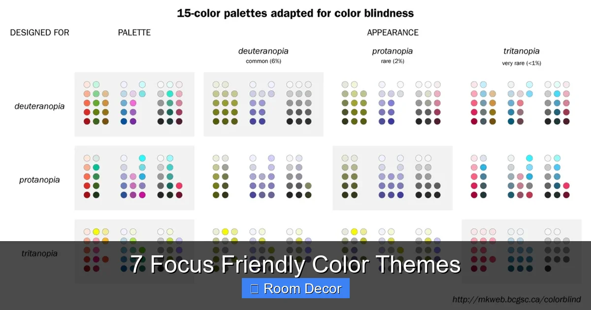
Sometimes, the best way to foster focus is to create a backdrop that is utterly unobtrusive. Earthy neutrals are among the most effective focus friendly color themes because they provide a stable, grounding environment that doesn’t compete for your attention. These colors are inspired by nature – sand, stone, soil, wood – and offer a timeless elegance while promoting a sense of calm and stability.
Why it’s focus-friendly:
Neutral colors are inherently non-distracting. They reduce visual stimulation, allowing your mind to stay clear and concentrated on the task at hand. The subtle warmth of earthy tones can also create a cozy, inviting atmosphere that feels secure and promotes sustained effort.
Key Color Palette:
* Neutrals: Beige, cream, tan, taupe, greige, soft brown.
* Accents: Off-white, muted charcoal, terracotta, very subtle greens or blues.
How to Apply in Your Room:
The beauty of earthy neutrals lies in their versatility. They form a perfect canvas for creating focus friendly color themes.
Visual guide about 7 Focus Friendly Color Themes
Image source: venngage-wordpress.s3.amazonaws.com
Walls:
Choose a warm off-white, a light beige, or a soft greige for your walls. These foundational colors will instantly make the room feel calm and expansive.
Furniture:
Natural wood furniture (oak, maple, walnut) is a perfect fit. Upholstered pieces in linen, cotton, or wool in cream, beige, or light grey shades will add comfort. Leather furniture in tan or brown can also work beautifully.
Accessories & Textiles:
Layer textures and subtle patterns. Think jute rugs, woven throws, ceramic pots, and natural fiber cushions. Introduce very gentle accent colors through a few carefully chosen pieces, like a small plant, a pottery vase, or a piece of art with muted tones.
Lighting:
Emphasize natural light whenever possible. Supplement with warm, ambient artificial lighting – lamps with natural wood bases or linen shades are ideal.
Best Suited For:
Home offices, living rooms, bedrooms, or any space where you desire a sophisticated, understated atmosphere that encourages sustained concentration.
Pro Tip:
Integrate a variety of natural textures (wood, linen, wool, ceramic) to add richness and depth to the neutral palette without introducing distracting colors.
3. Soft Sage & Cream: Nature’s Gentle Nudge for Clarity
Combining the soothing qualities of sage green with the comforting warmth of cream creates one of the most inviting focus friendly color themes. Sage is a muted, desaturated green that evokes tranquility and wisdom, while cream offers a soft, nurturing base. Together, they form a palette that feels natural, gentle, and incredibly conducive to clear thinking and focus.
Why it’s focus-friendly:
Sage green is known for its ability to reduce anxiety and promote balance, mimicking the calming effect of being in nature. Cream adds a touch of warmth and softness, preventing the space from feeling too cold or stark. This combination helps create a restorative environment where your mind can relax yet remain alert.
Key Color Palette:
* Primary: Soft sage green, creamy white, ivory.
* Accents: Light natural wood, muted terracotta, very pale grey.
How to Apply in Your Room:
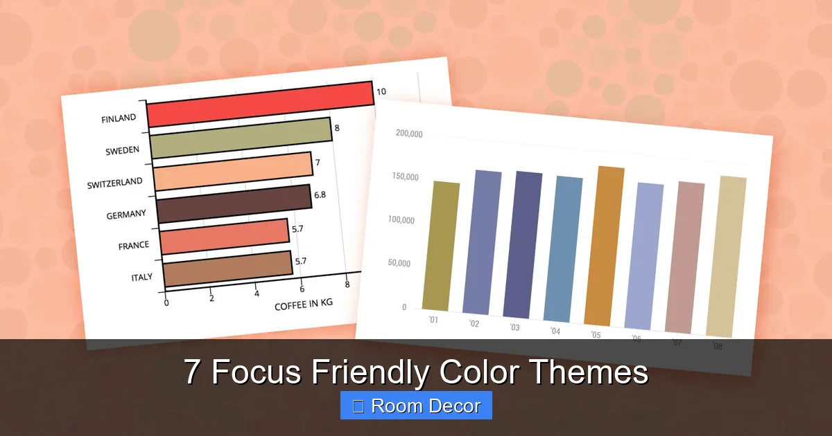
This theme is about creating a serene and understated elegance, perfect for focus friendly color themes.
Visual guide about 7 Focus Friendly Color Themes
Image source: venngage-wordpress.s3.amazonaws.com
Walls:
Consider painting walls a soft sage green or a warm creamy white. If you opt for cream walls, use sage green as a dominant accent in furniture or textiles.
Furniture:
Light-colored furniture (white, cream, light wood) works best to maintain the airy feel. A sage green desk chair or an armchair could be a lovely focal point. Natural wood desks and shelving units complement this palette beautifully.
Accessories & Textiles:
Layering is key here. Think creamy linen curtains, sage green throw blankets, and pillows with subtle textures. Add potted plants to enhance the natural feel. Ceramic pieces in off-white or light terracotta can introduce subtle warmth.
Lighting:
Soft, diffused lighting is crucial. Floor lamps and table lamps with warm bulbs and natural fiber shades will enhance the cozy, focused atmosphere.
Best Suited For:
Study nooks, bedrooms, reading corners, and tranquil home offices. It’s particularly effective for creative work that requires both calm and gentle inspiration.
Pro Tip:
Incorporate small touches of brass or gold in hardware or decorative items to add a touch of refined warmth without overpowering the gentle palette.
4. Muted Blues & Greys: Sophisticated Calm for Uninterrupted Work
For those who prefer a more modern and sophisticated aesthetic, muted blues and greys offer a powerful combination among focus friendly color themes. This palette brings together the intellectual clarity of blue with the grounding stability of grey, creating a sleek yet calming environment that promotes deep concentration and reduces stress.
Why it’s focus-friendly:
Muted blues are known to lower heart rate and blood pressure, creating a sense of calm, while grey provides a neutral, stable base that minimizes distractions. The “muted” aspect prevents these colors from feeling cold or overly stimulating, ensuring they support, rather than hinder, your focus.
Key Color Palette:
* Primary: Dusty blue, slate grey, light grey, warm grey (greige).
* Accents: Crisp white, charcoal, very subtle green or purple undertones in the grey.
How to Apply in Your Room:
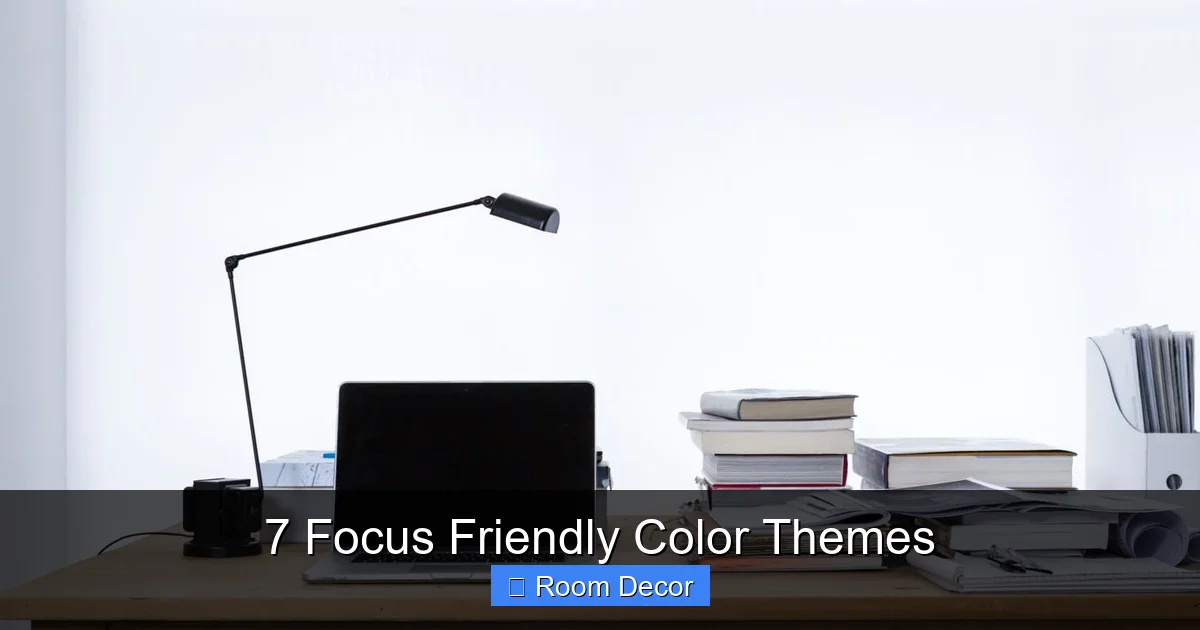
This theme works beautifully in contemporary or minimalist settings, making it a stellar choice for focus friendly color themes.
Visual guide about 7 Focus Friendly Color Themes
Image source: thefocuscourse.com
Walls:
Paint walls a light, muted blue or a soft light grey. An accent wall in a deeper slate grey or a rich dusty blue can add depth without overwhelming the space.
Furniture:
Choose furniture with clean lines. Light grey sofas, white desks, or dark grey office chairs work well. Metallic accents (chrome, brushed nickel) can enhance the modern feel. Natural wood pieces in lighter tones (birch, ash) can add warmth.
Accessories & Textiles:
Layer textiles in varying shades of blue and grey – think soft throws, textured cushions, and simple, elegant curtains. Introduce crisp white through frames, small decorative objects, or a white ceramic vase. A few select pieces of art with abstract or minimalist designs can add personality without distraction.
Lighting:
Utilize a mix of ambient, task, and accent lighting. Modern fixtures with clean lines are appropriate. Use smart bulbs to adjust color temperature from cool (for alertness) to warm (for winding down).
Best Suited For:
Modern home offices, executive studies, minimalist living rooms, or bedrooms where a calm and collected atmosphere is desired.
Pro Tip:
Incorporate reflective surfaces (e.g., a glass desk, a mirror) to bounce light and create an open, airy feel, which can also aid in mental clarity.
5. Warm Woods & Deep Greens: Nature’s Embrace for Grounded Productivity
Bring the grounding power of nature indoors with a theme that combines the richness of warm woods with the depth of forest or emerald greens. This is one of the more robust focus friendly color themes, offering a sense of stability, comfort, and an organic connection that can deeply enhance concentration and creativity.
Why it’s focus-friendly:
Warm wood tones (like walnut, mahogany, or cherry) create a sense of solidity and tradition, promoting comfort and focus. Deep greens are intensely restorative, echoing the stability and growth of nature. This combination reduces visual fatigue and encourages a feeling of being rooted, allowing for sustained periods of deep work.
Key Color Palette:
* Primary: Deep forest green, emerald green, warm browns (from wood).
* Accents: Cream, gold, brass, rich terracotta, hints of muted mustard or rust.
How to Apply in Your Room:
This theme creates a sophisticated and cozy, yet highly functional, environment, making it a unique choice for focus friendly color themes.
Walls:
Consider a deep green accent wall, or paint all walls a lighter, muted green to balance the richness of the wood. Cream or warm off-white walls provide a beautiful backdrop if you want the wood and green to stand out more prominently.
Furniture:
Invest in good quality warm wood furniture – a sturdy desk, bookshelves, or a credenza. Upholstered pieces in deep green velvet, dark brown leather, or cream linen would be stunning. Think comfortable, classic designs.
Accessories & Textiles:
Layer rich textures: wool rugs, velvet cushions, thick drapes. Brass or gold decorative objects, picture frames, and lighting fixtures will add warmth and elegance. Introduce indoor plants generously – ferns, snake plants, or a fiddle leaf fig will thrive here and enhance the green theme.
Lighting:
Emphasize warm, layered lighting. Desk lamps with brass finishes, floor lamps with fabric shades, and dimmable overhead lighting will create an inviting and focused atmosphere.
Best Suited For:
Traditional or eclectic home offices, libraries, studies, or living rooms where a sense of gravitas and deep concentration is desired.
Pro Tip:
Balance the rich tones with lighter elements (e.g., a cream rug or white ceiling) to prevent the room from feeling too dark or heavy.
6. Pale Lavender & Grey: Gentle Creativity and Calm Focus
For those seeking a more ethereal yet focused environment, the combination of pale lavender and soft grey offers a unique and calming option among focus friendly color themes. Lavender, often associated with relaxation and creativity, when used in its palest form, can foster a sense of gentle inspiration without being overly stimulating. Grey provides the necessary grounding and sophistication.
Why it’s focus-friendly:
Pale lavender, known for its calming properties, can reduce tension and promote a sense of well-being, which is essential for sustained focus. It subtly encourages creative thought without the distraction of bolder colors. Grey anchors the palette, providing stability and neutrality. Together, they create a dreamy yet functional space.
Key Color Palette:
* Primary: Pale lavender, dusty lilac, light grey, silver grey.
* Accents: Crisp white, very light birch wood, subtle metallic silver.
How to Apply in Your Room:
This theme is perfect for creating a soft, inviting, and focus-enhancing atmosphere.
Walls:
Paint walls a very pale lavender or a light, cool grey. If using lavender on the walls, ensure it’s very desaturated to avoid overwhelming the space. A subtle textured wallpaper in a pale grey can also be effective.
Furniture:
Opt for furniture in light colors – white, light grey, or natural light wood (birch, ash). A chair upholstered in a muted lavender fabric could be a focal point. Keep lines clean and uncluttered.
Accessories & Textiles:
Layer with soft, luxurious textiles: cashmere throws, silk pillows, sheer white or pale grey curtains. Introduce delicate floral patterns (subtly) or abstract art with soft curves. Silver accents (photo frames, small decorative bowls) will complement the cool tones beautifully.
Lighting:
Soft, diffused lighting is paramount. Lamps with opaque shades or those that cast a gentle glow are ideal. Avoid harsh direct light to maintain the ethereal quality of the room.
Best Suited For:
Creative studios, art spaces, meditation rooms, bedrooms, or personal studies where imagination and calm concentration are valued.
Pro Tip:
Introduce fresh flowers in complementary hues (white, pale pinks, deeper purples) to add a touch of natural beauty and subtle fragrance, enhancing the mood.
7. Minimalist White & Grey with Natural Accents: The Ultimate Clean Slate
When it comes to focus friendly color themes, sometimes less is truly more. A minimalist theme built on crisp white and soft grey, punctuated by natural wood and green accents, provides the cleanest slate for your mind. This approach is about eliminating visual noise, promoting clarity, and fostering an environment where focus can flourish undisturbed.
Why it’s focus-friendly:
White symbolizes purity, clarity, and openness, while grey provides balance and stability. This high-contrast yet harmonious pairing minimizes visual distractions, allowing your brain to process information more efficiently. Natural wood and green accents inject warmth and life, preventing the space from feeling sterile.
Key Color Palette:
* Primary: Crisp white, off-white, light grey, charcoal grey.
* Accents: Natural wood tones (light or medium), vibrant green from plants.
How to Apply in Your Room:
This theme is about intentionality and simplicity, making it a prime example of effective focus friendly color themes.
Walls:
Paint walls a bright, clean white or a very pale, warm grey. This forms the expansive, uncluttered backdrop. Ensure the white isn’t too stark; an off-white with a hint of warmth can be more inviting.
Furniture:
Choose furniture with minimalist designs and clean lines. White desks, light grey sofas, and natural wood shelving units are perfect. Prioritize functionality and avoid excessive ornamentation.
Accessories & Textiles:
Keep accessories minimal and intentional. A few well-chosen items work best: a statement plant (e.g., a large monstera or olive tree), a simple ceramic vase, a stack of aesthetically pleasing books. Textiles should be plain, textured (e.g., linen, cotton), and in shades of white, grey, or natural fibers. Avoid busy patterns.
Lighting:
Maximize natural light. Use sheer white curtains or blinds that can be opened fully. For artificial light, choose sleek, functional fixtures. A combination of overhead ambient light, a bright task lamp, and subtle accent lighting can create a versatile environment.
Best Suited For:
Minimalist home offices, modern study areas, creative studios, or any space where decluttering the mind is as important as decluttering the room.
Pro Tip:
Integrate a smart storage system to keep clutter out of sight, which is crucial for maintaining the minimalist, focus-friendly aesthetic.
Common Pitfalls and How to Avoid Them
Even with the best intentions, it’s easy to accidentally undermine your focus friendly color themes. Here are some common mistakes to watch out for:
Over-Stimulating Accents:
While a pop of color can be nice, too many bright or high-contrast accents can counteract the calming effect of your primary palette. Stick to one or two subtle accent colors, or rely on natural textures for visual interest.
Ignoring Lighting:
Poor lighting can strain your eyes and make even the most serene room uncomfortable. Ensure you have ample natural light, and supplement with warm, diffused artificial lighting. Avoid harsh fluorescent lights.
Clutter is the Enemy of Focus:
No matter how perfect your color theme, a cluttered space will always be distracting. Implement effective storage solutions and make decluttering a regular habit to maintain a clear, focus-friendly environment.
Neglecting Ergonomics:
An uncomfortable chair or a poorly arranged desk can quickly derail your focus. Invest in ergonomic furniture that supports your posture, even if it means slightly adjusting your aesthetic.
Forgetting Personal Preference:
While these are generally focus friendly color themes, ultimately, your personal comfort is key. If a color generally considered “calming” feels cold or uninviting to you, explore a different variation or theme. Your space should feel good to you.
Conclusion
Creating a space that fosters focus and productivity is an investment in your well-being and success. By carefully selecting one of these 7 focus friendly color themes, you can transform your room into a sanctuary designed for concentration, creativity, and calm. Remember, it’s not just about the colors on your walls, but how they integrate with your furniture, textiles, lighting, and overall sense of order. Embrace the power of color psychology, apply these tips, and watch as your environment becomes a powerful ally in achieving your goals. Happy decorating, and may your focus be unwavering!