
Transform your home into a serene sanctuary with 8 wood inspired natural color themes. This guide offers a practical, step-by-step approach to selecting and implementing harmonious natural wood colors, from light birch to rich walnut, ensuring a cohesive and inviting living space. Learn how to blend primary colors with textures and accents for a truly personalized aesthetic, embracing the timeless beauty of natural wood.
8 Wood Inspired Natural Color Themes
Welcome, fellow home decorator! Are you yearning for a living space that feels calm, inviting, and deeply connected to nature? There’s something truly special about the warmth and authenticity that wood brings to a home. Beyond just furniture, wood offers a spectacular range of natural colors and tones that can inspire an entire room’s palette. These aren’t just trendy colors; they are timeless hues that create an instant sense of tranquility and comfort.
In this comprehensive guide, we’ll dive deep into 8 distinct wood inspired natural color themes. You’ll learn how to harness the inherent beauty of different wood types and translate them into stunning color schemes for your walls, furniture, and decor. We’ll walk you through practical steps to implement these themes, offer tips for creating cohesion, and even tackle common challenges. Get ready to transform your home into a serene sanctuary that celebrates the enduring charm of nature!
Key Takeaways
- Embrace Nature’s Palette: Wood inspired natural color themes offer a diverse and timeless palette, providing warmth, serenity, and a connection to the outdoors for any room.
- Start with a Core Wood Tone: Identify a primary wood inspiration (e.g., pale birch, rich walnut) as the foundation for your theme, then build your color scheme around its inherent tones.
- Layer Colors and Textures: Combine paint colors, furniture, textiles, and decor in varying shades and textures to create depth and visual interest within your chosen theme.
- Prioritize Testing: Always test paint swatches and material samples in your actual space under different lighting conditions before making final commitments.
- Consider Lighting Carefully: Both natural and artificial lighting significantly impact how colors appear. Plan your lighting to enhance the warmth and richness of your chosen wood inspired natural color themes.
- Incorporate Natural Elements: Beyond wood, integrate other natural materials like stone, wool, linen, and plenty of live greenery to fully realize a cohesive and vibrant natural aesthetic.
- Balance Warm and Cool: Learn to thoughtfully mix warm wood tones with complementary cool accents (or vice versa) to achieve a harmonious and inviting balance in your decor.
Understanding Wood’s Natural Palette
Before we explore specific themes, let’s appreciate the incredible spectrum of colors found in wood. From the almost white hues of birch and maple to the deep, rich chocolates of walnut and ebony, wood presents a beautiful foundation for any natural color theme. Each wood type has its own undertones – some are cool and gray, others are warm and golden, while some lean towards red or orange. Understanding these nuances is key to selecting harmonious wood inspired natural color themes for your space.
Preparing Your Space for a New Color Theme

Visual guide about 8 Wood Inspired Natural Color Themes
Image source: i.pinimg.com
Before you grab a paint brush, take a moment to assess your room. What existing elements are staying? Do you have large windows letting in ample natural light, or is the room naturally darker? The light in your space will dramatically affect how colors appear. Also, consider the room’s purpose. A bedroom might benefit from softer, more muted wood inspired natural color themes, while a living room could handle richer, bolder tones.
Exploring 8 Wood Inspired Natural Color Themes
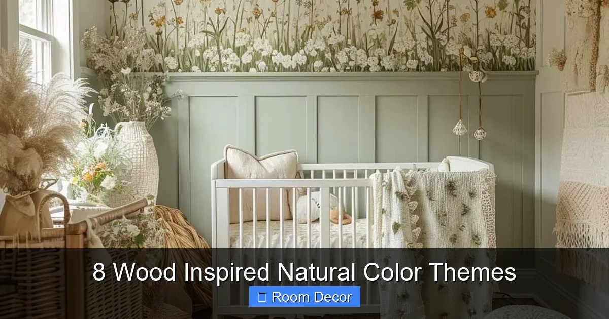
Visual guide about 8 Wood Inspired Natural Color Themes
Image source: artfasad.com
Let’s dive into our curated collection of wood inspired natural color themes, each offering a unique feel and aesthetic.
Pale Birch & Misty Gray
This theme draws its inspiration from the light, airy tones of birch wood, often seen in minimalist Scandinavian designs. It’s perfect for creating a serene, spacious, and modern feel.
- Wood Inspiration: Light birch, ash, bleached oak.
- Key Color Palette:
- Primary: Soft off-white, light gray, muted taupe.
- Secondary: Pale blues, mint greens, very light dusty rose.
- Accents: White, cream, subtle silver or brushed nickel.
- Mood: Calm, fresh, minimalist, airy, sophisticated.
- How to Use:
- Keep walls in a soft white or light gray to maximize light and space.
- Opt for furniture in natural light woods like birch or ash.
- Introduce textiles in soft cottons, linens, and light wools in coordinating pale shades.
- Accessorize with ceramic vases, simple framed art, and metallic accents for a touch of elegance.
Golden Oak & Forest Green
Inspired by the warm, inviting glow of classic oak, this theme pairs beautifully with the tranquil depth of forest green, creating a comforting and grounded atmosphere.
- Wood Inspiration: Golden oak, honey-toned maple.
- Key Color Palette:
- Primary: Warm beige, cream, light olive green.
- Secondary: Deep forest green, moss green, earthy browns.
- Accents: Brass, bronze, rustic iron.
- Mood: Cozy, traditional, earthy, comforting, timeless.
- How to Use:
- Consider painting an accent wall in a deep forest green, or use it for upholstery.
- Incorporate golden oak furniture – whether vintage or new – as a central element.
- Layer in textiles like wool throws, velvet cushions, and woven rugs in coordinating greens and browns.
- Bring in plenty of live plants to enhance the natural feel.
Rich Walnut & Deep Indigo
This sophisticated theme takes cues from the luxurious, dark chocolate tones of walnut wood and pairs it with the profound elegance of deep indigo blue, perfect for creating a dramatic yet welcoming space.
- Wood Inspiration: Dark walnut, rich mahogany.
- Key Color Palette:
- Primary: Cream, warm off-white, soft charcoal.
- Secondary: Deep indigo, navy blue, charcoal gray.
- Accents: Gold, brass, black.
- Mood: Elegant, luxurious, masculine, moody, refined.
- How to Use:
- Walnut furniture pieces will shine against lighter walls (cream, soft gray) or be strikingly bold against a deep indigo accent wall.
- Velvet or linen upholstery in indigo or navy works beautifully.
- Add metallic accents like gold picture frames or brass lamps.
- Keep decor refined and uncluttered to let the rich colors speak.
Weathered Teak & Sandy Beige
Imagine a sun-drenched beach house or a rustic coastal retreat. This theme embodies the soft, silvery-gray patina of weathered teak and combines it with warm, sandy tones for a relaxed and airy vibe.
- Wood Inspiration: Weathered teak, driftwood, aged cedar.
- Key Color Palette:
- Primary: Sandy beige, warm taupe, off-white.
- Secondary: Pale sky blue, seafoam green, soft gray.
- Accents: Distressed white, natural rope, rattan.
- Mood: Coastal, relaxed, tranquil, natural, serene.
- How to Use:
- Paint walls in a warm sandy beige or off-white.
- Choose furniture with a weathered finish, or natural rattan and wicker.
- Incorporate linen and cotton textiles in pale blues and greens.
- Decorate with shells, dried grasses, and simple ceramic pieces to enhance the coastal feel.
Cherry Blossom & Creamy White
Inspired by the reddish-brown blush of cherry wood, this theme pairs its inherent warmth with soft, creamy whites and delicate pinks for a romantic and inviting ambiance.
- Wood Inspiration: Cherry, reddish-brown stained woods.
- Key Color Palette:
- Primary: Creamy white, warm off-white, light blush pink.
- Secondary: Soft rose, pale terracotta, muted cranberry.
- Accents: Brushed copper, rose gold, antique brass.
- Mood: Romantic, feminine, soft, warm, cheerful.
- How to Use:
- Use creamy white on walls to provide a clean backdrop.
- Cherry wood furniture will provide the warmth; balance it with soft pink textiles.
- Floral patterns, delicate artwork, and subtle metallic accents will complete the look.
- This theme works wonderfully in bedrooms or sunrooms.
Dark Ebony & Charcoal Black
For those who embrace bold sophistication, this theme takes cues from the striking darkness of ebony wood, softened by the nuanced tones of charcoal and deep gray. It’s dramatic, modern, and incredibly chic.
- Wood Inspiration: Ebony, wenge, very dark stained wood.
- Key Color Palette:
- Primary: Charcoal gray, deep slate, true black.
- Secondary: Crisp white, silver, very dark plum or navy.
- Accents: Chrome, polished nickel, deep jewel tones (emerald, ruby).
- Mood: Modern, sophisticated, dramatic, urban, minimalist.
- How to Use:
- An accent wall in charcoal or even black can create immense depth. Keep other walls white or light gray to prevent the room from feeling too small.
- Ebony-stained furniture provides strong visual anchors.
- Incorporate high-contrast elements with crisp white textiles or artwork.
- Use metallic accents sparingly for a touch of glam.
Redwood Rust & Earthy Terracotta
This theme celebrates the rich, warm, reddish-brown of redwood, blending it with the sun-baked hues of terracotta and deep earth tones for a grounded, rustic, and vibrant space.
- Wood Inspiration: Redwood, cedar, warm mahogany.
- Key Color Palette:
- Primary: Terracotta, burnt orange, warm rust brown.
- Secondary: Olive green, muted mustard, deep cream.
- Accents: Black iron, unpolished copper, natural stone.
- Mood: Rustic, bohemian, warm, inviting, energetic.
- How to Use:
- Walls can be a lighter terracotta or a deep cream to let the wood and accent colors shine.
- Redwood furniture, or pieces with similar warm red undertones, will be central.
- Layer with textures like woven rugs, leather, and pottery.
- Introduce succulents and other hardy plants in terracotta pots.
Spalted Maple & Sage Green
Spalted maple, with its unique dark lines and creamy background, is visually fascinating. This theme captures its intricate beauty by pairing it with the calming, muted tones of sage green and soft grays.
- Wood Inspiration: Spalted maple, burled wood, light exotic woods.
- Key Color Palette:
- Primary: Sage green, soft gray-green, creamy white.
- Secondary: Charcoal gray, light mushroom brown, pale blue.
- Accents: Black, matte white, natural stone.
- Mood: Organic, tranquil, natural, understated, artistic.
- How to Use:
- Paint walls in a soft sage green or creamy white.
- Look for furniture pieces that highlight interesting wood grain, like spalted maple if possible, or light-colored wood with natural variation.
- Use textured textiles in natural fibers.
- Keep decor simple, focusing on organic shapes and textures.
Step-by-Step Guide to Implementing Your Chosen Theme

Visual guide about 8 Wood Inspired Natural Color Themes
Image source: parr.durasupreme.com
Now that you have your ideal wood inspired natural color theme in mind, let’s talk about bringing it to life.
Step 1: Analyze Your Existing Space and Permanent Fixtures
Look at your flooring, trim, and any built-in cabinetry. Do they have a dominant wood tone? Your new theme should either complement or thoughtfully contrast these existing elements. For example, if you have warm oak floors, choosing a cool-toned birch theme will require careful balancing to avoid clashes.
Step 2: Define Your Primary and Secondary Colors
Based on your chosen theme, identify the main wall color(s) and two to three secondary colors for upholstery, larger decor items, or accent walls. Also, pick one or two accent colors for smaller details. These are your foundational hues.
Step 3: Test Colors with Swatches
Never skip this step! Paint large swatches of your chosen wall colors directly onto your walls, or use large peel-and-stick samples. Observe them at different times of day – morning, afternoon, and evening – under both natural and artificial light. Colors can look drastically different in your home than they do in a store.
Step 4: Plan Your Paint and Finishes
Decide which walls to paint what color. Consider using different finishes (matte, eggshell, satin) to add subtle texture and depth. Remember, light colors make a room feel larger, while darker colors can create coziness and drama.
Step 5: Select Furniture & Textiles
This is where your chosen wood inspiration truly shines. Select furniture pieces that align with your theme’s primary wood tone – whether it’s pale birch, golden oak, or rich walnut. Then, layer in textiles like curtains, rugs, pillows, and throws that incorporate your secondary and accent colors. Mix textures like linen, wool, velvet, and cotton for visual interest.
Step 6: Add Accents & Decor
Finally, bring in the smaller details that tie everything together. Artwork, lamps, vases, and decorative objects should reinforce your chosen wood inspired natural color themes. Don’t forget the power of greenery! Live plants add an essential touch of life and natural vibrancy to any space.
Tips for Harmonious Wood Inspired Natural Color Themes
Achieving a truly cohesive look requires more than just picking colors. Here are some pro tips:
Balancing Warm and Cool Tones
Most wood tones are inherently warm (red, orange, yellow undertones). When using warm wood, consider balancing it with cooler paint colors (grays, blues, greens) or vice-versa to prevent the room from feeling too monotone or overwhelming. A pale birch (cool) might be balanced with warmer cream walls, for example.
Incorporating Texture
Texture is just as important as color in natural themes. Think about rough-hewn wood, soft wool, smooth stone, woven rattan, and sleek metal. Mixing these textures adds depth and dimension, making your space feel richer and more inviting.
Lighting Considerations
Natural light is best for revealing the true beauty of natural colors. Enhance it with sheer curtains or by keeping windows unobstructed. For artificial light, consider bulbs with a warmer color temperature (around 2700K-3000K) to complement warm wood tones, or cooler temperatures (3500K-4000K) for more modern, cool-toned themes.
Don’t Forget the Greenery
Live plants are non-negotiable for a truly natural look. They bring a vibrant pop of color, improve air quality, and instantly connect your indoor space with the outdoors, reinforcing your wood inspired natural color themes beautifully.
Troubleshooting Common Color Challenges
Even with careful planning, sometimes things don’t go exactly as expected.
When a Room Feels Too Dark
If your chosen wood inspired natural color themes make your room feel too heavy or dark:
- Add More Light: Introduce additional lamps (floor lamps, table lamps) and ensure they have ample wattage.
- Lighten Accents: Swap out dark pillows, throws, or artwork for lighter, brighter versions.
- Incorporate Reflective Surfaces: Add mirrors, glass tables, or metallic decor to bounce light around the room.
- Consider a Lighter Accent Wall: If one wall is very dark, consider repainting it in a lighter, complementary shade.
When a Room Lacks Cohesion
If your space feels disconnected or “choppy”:
- Repeat Colors: Ensure your primary and secondary colors appear in at least three different spots around the room.
- Use a Large Area Rug: A rug can anchor a space and visually connect disparate furniture pieces. Choose one that includes colors from your palette.
- Declutter: Too many small, unrelated items can make a room feel chaotic. Remove anything that doesn’t fit your theme.
- Introduce a “Bridge” Color: Find a color that naturally exists in multiple elements and amplify it slightly to tie them together.
Dealing with Existing Wood Tones
If you have existing wood trim, flooring, or furniture that you can’t change:
- Embrace and Complement: Instead of fighting it, use your existing wood tone as the foundation for your theme. If you have warm cherry, lean into a cherry blossom theme.
- Strategic Contrast: Sometimes, a strong, deliberate contrast can work. For example, very light, almost white walls can make rich, dark wood trim pop beautifully.
- Layer with Rugs: If your floor wood tone is problematic, a large area rug can cover most of it and introduce your desired color palette.
Conclusion: Embracing Nature’s Palette
Creating a home that feels like a natural extension of the outdoors is a truly rewarding endeavor. By carefully selecting and implementing one of these wood inspired natural color themes, you’re not just choosing colors; you’re crafting an experience. You’re bringing warmth, serenity, and a timeless beauty into your living spaces. Remember, the goal is to create a harmonious environment that reflects your style and provides a comforting retreat. So, go forth and embrace the inspiring palette of wood – your serene sanctuary awaits!